Media is a word that is used a lot, especially in my past industry of advertising, but we may not stop to think about the origin of the word itself. Media is the plural of medium, and in our particular context, medium is defined as “the intervening substance through which impressions are conveyed to the senses.”
When defined this way, media are powerful stuff. Let me give you a personal example.
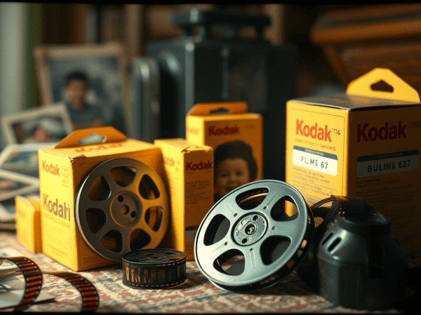
At a recent family gathering a few cousins were talking about old 8 mm home movies. Some of you know what I’m talking about. You might even have some yourself, stuck somewhere in your attic or basement. They came in yellow-orange boxes from Kodak and might have “Kodachrome II” on the front. In my case, I had some which I salvaged from my mom during her transfer to her care facility. Two of my cousins similarly took custody of their films from their respective mothers. I packed what I could of these in my suitcase and gingerly transported them home, after trying to explain what they were to a curious TSA official and why they couldn’t go through an X-Ray scanner.
When I got them home, I transferred them to digital. Then, starting December 1st, I have been sharing small snippets of the resulting videos with the rest of my family, one a day in a type of home movie Advent Calendar.
Most of these home movies were shot between the mid 1950’s and mid 1960’s; capturing picnics, weekends at the family cottage north of Toronto, weddings, birthdays, going away parties, Christmases and other assorted occasions. I’ll soon tell you what this sharing of one particular medium has meant to my family and I, but first I want to give you a little background on 8 mm home movies, because I think it helps to understand why they were such an important medium.
The 8 mm format was introduced by Kodak in 1932. It was actually a 16mm format that had to be flipped and run through the camera twice. In processing, the film would be split and spliced together to create a 50 ft reel, capturing about 3 to 4 minutes.
Kodak hoped to extend the ability to make movies to the home market, but between the Great Depression and World War II, the format didn’t gain real traction until the post-war consumerism boom. Then, thanks to smaller cameras that were easier to use and improved picture quality, 8 mm movie cameras became more common place and started showing up at family gatherings, weddings, honeymoons, vacations and other notable events.
It would have been in the mid 1950’s that my mother’s family bought their first cameras. My grandfather and grandmother, a few great uncles and my mom and dad all became amateur movie makers. Suddenly, many family events became multi-camera shoots.
It was the results of this movie making boom in my family that I recently started digging through, rounding up those little yellow boxes, delicately threading the fragile film into a digital scanning system and letting grainy and poorly lit moving pictures transport me back to a time I had only heard stories about before.
Let me tell you what that meant to my family and myself. I never met my maternal grandfather (or my paternal one either, but that’s another story for another time). He passed away two weeks after I was born. I also never knew my father. He tragically died when I was just one year old. These were two man I desperately wanted to know, but never had the chance. I only knew them through still photos and stories passed on from older family members.
But suddenly, there they were; moving, laughing and living. My grandfather teasing my grandmother mercilessly and then sitting back in his easy chair with a big smile on his face as he watched his family around him. My father at his and my mom’s wedding, holding a huge cigar in one hand while he picked confetti out of his hair with the other. “My God!,” I thought, “he stands just like me!”
This medium, long forgotten as it sat in dusty boxes, brought my grandfather and father back to life for me. It colored in the outline sketches I had of who they were. For my family, these movies reconnected us to our younger selves, brought loved ones back, introduced the younger members to their direct ancestors and – for myself and others – shed new light on figures in our past that had been shrouded in the shadows of time.
Because of this project, two things became clear to me. First of all, if you have also inherited old media filled with family memories, find the time to transfer them into a medium that allows them to be shared and preserved for the future in some type of transferable format. The act of archiving brings up images of bespectacled staff peering over dusty tomes and pulling forgotten boxes from the top shelf. But it is simply the act of imbuing the past with a type of permanence so it always remains accessible.
Secondly, recognize the importance of any type of medium that captures the moments of our lives. Rick Prelinger, an archivist in California, has compiled a collection of over 30,000 home movies. He published a list of 22 reasons why home movies are important. For me, number 21 resonated most deeply: “showing and reusing (these movies) today invests audiences with the feeling that their own lives are also worth recording.”
I’m sure my dad or granddad had no idea of their own impending mortality when they were captured on these movies. They weren’t planning on being memorialized. They didn’t realize the importance of the moment – or the medium.
But today, these movies are one of the all-too-rare things we have to remember who they were. For me, it was this medium that erased the time and distance between my senses, here at the end of 2025, and that day in June, 1957 – the day my parents got married.
Thank Heavens someone was there with a camera.