The Rule of Three in Search

First published July 20, 2006 in Mediapost’s Search Insider

Once again, I find myself up to my earlobes in eye-tracking data. I have no one to blame, as I got myself into this mess when I made the well-intentioned but poorly thought out promise to have the first draft of a study done by the time I head out on vacation at the end of the month.

In wading through the sessions (about 420 of them) sometimes new insights rise to the top–and sometimes my eyeballs just roll back in my head as my hands jerk spasmodically on my keyboard and drool runs down my cheek. Luckily, this week it was the former.

In this study, we are looking at interactions with Google, compared to MSN and Yahoo. Recently, one finding in particular seemed to be screaming out to be noticed. Being a compassionate sort of researcher, I listened.

When we looked at interactions with the top sponsored ads, there was a notable difference between MSN, Yahoo and Google. On MSN and Google, the percentage of clicks happening on these top ads seemed to be in line with previous studies done both by us and by others. But the amount of activity on the Yahoo ads seemed to be substantially higher. We started out by looking at first fixations, or the first place people looked on the page, even for a split second. Here, the engines were all in the same ball park, with 83.7 percent of first fixations in top sponsored ads for Yahoo, compared to 86.7 percent for MSN and 80.6 percent for Google.

Then, we looked at where the first activity on listing happened; where on the page did people start actually scanning listings? Google held a good percentage of eyeballs, keeping 12.4 percent of the users, while MSN had a significant defection issue, losing 36.6 percent of the people who first fixated in the top sponsored ads. But Yahoo lost the fewest, with only 5.5 percent choosing to look elsewhere. And finally, Google had 25.8 percent click-throughs on these ads, and MSN had 16.7 percent (yes, this is low, but MSN was dealing with a number of issues at the time of the study). Yahoo led the pack with a 30.2 percent click-through rate. In fact, for the first time ever in our research, a sponsored link (the number one top sponsored) out-pulled the No. 1 organic link, at click-through rates of 25.6 percent vs. 14 percent. This was a complete reversal of the click-through ratios we saw on the other two engines.

For whatever reason, Yahoo’s top sponsored ads seemed to be locking searchers into their part of the results page to a much greater extent than Google and MSN.

Why? What the heck was going on? Better ads? Not really. If anything, Google’s ads seemed a touch more relevant.

Location, Location, Location

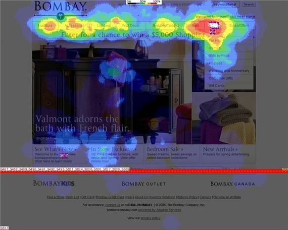
Part of it was real estate. Another interesting comparison we did was to look at the percentages of screen real estate devoted to various sections of the page. Yahoo has gone out of its way to make the top sponsored ads the dominant feature on a results page at 1024 by 768 screen resolution. At this size, the ads take up 23 percent of the real estate, compared to approximately 16 percent for Google and Yahoo. This pushes organic listings on Yahoo perilously close to the fold.

And there, as I stared at the screen shots of fully loaded (maximum ads and vertical results showing) Google, MSN and Yahoo results at standard resolution, a possible answer revealed itself. On Google, three top sponsored ads, three OneBox results, and three visible organic listings. On MSN, the same three:three:three presentation. But on Yahoo, there were four top sponsored ads, three vertical results, and just one and a half organic listings were visible.

The Rule of Three

Hmmm, three, three and three. There was something there, niggling in the back of my mind. Quickly, I did a search for the “Rule of Three” and sure enough, there it was. We humans tend to think in triplets. Three is a good number to wrap our mind around, and we see it in all kinds of instances. We tend to remember points best when given in groups of three, we scan visual elements best when they come in threes, and we like to have three options to consider. Think how often three comes up in our society: three little pigs, three strikes, three doors on “Let’s Make a Deal,” three competitive quotes. It’s a triordered world out there.

So is it coincidence that search results tend to be presented to us, neatly ordered in groups of three? I think not. It strikes me that this engrained human behavior would probably translate to the search engine results page as well.

The Ruler-breaker

MSN and Google tend to adhere to the rule of three in their layouts (depending on whether or not Google serves three top sponsored ads). Our choices are conveniently presented in neat trios, with logical divides between each.

Yahoo breaks the rule by tipping the balance in favor of the top sponsored ads. First, it provides four results, not three. Does this mean we need to spend a little more time up in these results, trying to fit one extra one into our limited memory slots? That appears to be the case, with people spending an average of 4.6 seconds in the Yahoo top sponsored results in our study, compared to 2.4 seconds for Google and 1.73 seconds for MSN.

Second, it only gives us one visible organic listing to consider. It breaks our natural desire to have three alternatives, thereby reducing the Promise of Interest for the organic listings. In effect, on the screen of results most people would see on Yahoo, we only have one alternative, the top sponsored ads.

An earth-shaking discovery? Perhaps not. But cut me some slack. I’ve been looking at eye-tracking data daily for three months now, spending about three hours each day looking at interactions with the three engines. I think it’s time I took the three other members of my family on a three-week vacation, during which we’ll be visiting three countries. Wait a minute! Do I sense a pattern developing?

Dear Google Search History

First published July 13, 2006 in Mediapost’s Search Insider

In the 1600s, Samuel Pepys became history’s most famous diarist. From 1660 to 1669, this English Member of Parliament kept a detailed diary, which was published posthumously. In it, we gain a fascinating eyewitness account of the Great Plague and the Great Fire of London. Most passages were not so monumental, however. Here’s one example from July of 1663:

Up betimes to my office, and there all the morning doing business, at noon to the Change, and there met with several people, among others Captain Cox, and with him to a Coffee [House], and drank with him and some other merchants. Good discourse. Thence home and to dinner, and, after a little alone at my viol, to the office, where we sat all the afternoon, and so rose at the evening, and then home to supper and to bed, after a little musique.

Sounds like Sam pretty much polished work off by noon and spent the rest of the time drinking, gossiping, playing the ol’ viol and listening to some tunes. All in all, not a bad life! No wonder he had the free time to write about it.

The Diary I Didn’t Know Existed…

I never considered myself a diarist. I’m much too busy actually trying to get through my life to spend time writing about it. I suppose the odd blog post would be autobiographical, but other than that, I didn’t think I was leaving an account of my day-to-day thoughts. I was wrong.

Some time ago, I signed up for a Google Analytics account for my blog and at the time, I somehow activated Google’s Personal Search History function. Because I have a laptop, and tend to use the same computer at work and at home, I was unknowingly capturing a pretty complete snapshot of all my search activity. Just a few days ago, I realized I was still logged in. Today, I took a look back at two months of search activity.

…A Day-by-Day, Search-by-Search History…

First of all, in the past two months, I’ve searched 540 times. That’s an average of 9 searches a day. In looking at the log of day-to-day activity, I can pretty much tell exactly what I was doing, and what thoughts preoccupied me, on any given day from May 11 to today. The topics are a little scattered. In a one-hour period on June 5, I went from looking for what an average winning percentage was on Freecell (don’t ask), to looking up the details on a new business contact, to looking for a new design template for my blog, to looking for GPS software for an upcoming trip to Europe. Can you say attention deficit?

In a quick analysis of my activity, it seems that 59 percent of my search activity is work-related, and 41 percent is personal. Twenty-eight percent of my searches were navigational (I knew what site I wanted to end up on, and was using the search engine to get there) and 71 percent were what I call “mapping” searches (where I was looking for the search engine to suggest sites I was previously unaware of). And in 34 percent of my searches, I never actually clicked on a result.

…And That Was Just Mine…

The point is not to go on about how I search. You could care less. The point is that search history gave me a snapshot of just what I was thinking about, at an average of about nine times a day. In looking back, I could remember what I was working on, what products I suddenly thought I needed, how much planning I was doing for an upcoming vacation, what new acquaintances I suddenly decided to Google to find out more about, and what arguments needed to be settled. I’d see queries come up, disappear for a few days, then suddenly re-emerge later, either in the same or modified form. It made me realize how integral online is to my life, and how much I depend on search to connect me to the vast and diverse content that sits out there. It mirrored my thoughts about upcoming purchases, life events, things that were bothering me, issues at work and just plain old time-wasters.

Now consider the implications of this. I’m one person, who actually lived the life in question, and I was amazed by the insight gained by looking back. Consider this data in aggregate form. No wonder John Battelle was blown away by what he called the “database of intentions,” this gargantuan deposit of data that is owned by the search engines, providing intimate glimpses into individuals at the micro level, and incredibly granular macro mosaics as we step back. Based on the search trail and clickstream I looked at, Google, if it chooses to, would know more about me than my wife (keep the snarky comments to yourself). And remember, search history is just the data Google chooses to make public. Through the tool bar, it’s capturing a lot more clickstream data on you.

…What About Yours?

The whole “Big Brother” aspect of this has been commented on numerous times in the past. Sure, it’s frightening, but I think it’s tied up in the new reality of our online world. Is the fact that it sits in the hands of a private corporation any more troubling than the huge amount of personal information that sits in government files? Theoretically, we have democratic recourse with the government, but we all know how much weight that holds. Take some comfort in the fact that Google, with all its billions and resources, has exactly 1.5 people working in its sales and market research department (although I’m hearing rumors of a new addition). For the foreseeable future, Google might have a frightening amount of data, but it doesn’t have anyone with the time to look at it.
Read more: http://www.mediapost.com/publications/article/45508/dear-google-search-history.html#ixzz2ZoaFoUTS

Branded Terms in Search Results: Pre-Mapping in Action

First published July 6, 2006 in Mediapost’s Search Insider

Two separate occurrences in the last little while have lent credence to a behavioral occurrence we’ve seen in many of our studies.

First, I was sitting in on a meeting where an agency (not ours) was reporting on the performance of its sponsored search campaigns and was ecstatic with the performance of its branded term phrases, which were outperforming every other keyword bucket both in terms of click-throughs and conversions. While giddy with delight, company executives were at a bit of a loss to explain why.

On a similar track, a search marketing firm has recently released some results that looked at cannibalization of search campaigns when you are buying terms where you also hold top organic position. Again, they found this is most likely to happen when you’re buying branded terms.

While neither of these examples should be surprising to a seasoned search marketer, we’re all interested to know the reasons behind this interplay between organic and sponsored, particularly on branded terms. The answer, as it so often does, lies in looking more closely at what the search user is doing.

Pre-Mapping: A Theory

After looking at thousands of search sessions in detail, one thing is becoming clear. Searchers are incredibly adept at focusing in on just the portion of the results page that interests them. The time required to relocate to the prime real estate is literally a fraction of a second. Yet that real estate isn’t always the same spot. It varies depending on query and intent. It also varies by user, but even the same users will navigate the real estate of the listings in very different ways, depending on what they’re looking for.

Pre-Mapping supposes that we’ve interacted with search results pages enough to know the sections of real estate we typically deal with. We know where the top sponsored ads are and what they are. We know about where the top organic listings start. And in our minds, we already have a good idea of the type of site we’re looking for and approximately where we expect it to appear. Before the page ever loads, we’ve already mapped out the sections that would appear to hold the greatest promise to deliver on our intent. As the page loads, we do a split-second scan to get our bearings (orient in the top left corner, see how many top ads there are, see where organic starts) and then we go to the part of the map we’ve predetermined to be our best starting point.

Theory in Practice

Let’s run through a few examples. Imagine you’re looking for the possible side effects of a medication. The types of sites you would be looking for would be authoritative information sites, either the official site for the medication, a recognized health portal or possibly a government information site. In this case, you may be leaning more towards objective sites, rather than the pharmaceutical company’s own site. After launching the search (the name of the drug) you’ll quickly filter out, or thin slice, any commercially oriented sites. In this type of interaction, you’ve determined through pre-mapping that your area of greatest promise is not likely to be in the sponsored ads. You also expect the official site to rank No. 1 organically, so your area of greatest promise is probably in the No. 2 to 5 organic rankings, where you expect the types of sites you’re looking for to sit. In a split second, you’ve narrowed the real estate where you’ll start your active scanning to about 10 percent of the total real estate.

Now, let’s say you’re looking to renew your auto insurance. You’ve already checked out a few quotes online, but before you commit to any, you want to see how your current carrier compares. You’ve also pre-mapped the page in this case. Here, you expect your company to be bidding for the term ( “Brand Name auto insurance”) and because it’s a commercially oriented query, you assume that the sponsored listing would take you to a page where you could get a quote. Your area of greatest promise is the top sponsored ads. Again, you do your orientation scan to find your bearings in the upper left, but in this case, you would start right at the top sponsored link and work your way down the page until you find a link to the carrier in question that offers the promise of giving you a quote.

Theory Applied

Considering these two examples of user behavior, you can easily see what was happening in the two anecdotes I cited at the beginning of this piece. Brand terms will convert like gangbusters in the top sponsored location, because when a brand term is used, it’s very likely that the user has pre-mapped and is expecting to find that site in those top sponsored spots.

Similarly, you will find significant cannibalization because when users have pre-mapped, they start at the top and work down. They’ll hit the sponsored result before they hit any organic result that might appear. They’re looking for the quickest route, and in this case, the sponsored listing is giving it to them.

The likelihood to pre-map, and what this means for interaction for the page, lies in that deep dark place where all the answers to search engine success lie, the mind of your target prospect. Spend some time exploring it.

Wise Words about Branding from the Usability Sage

First published June 29, 2006 in Mediapost’s Search Insider

Jakob Nielsen knows a lot about usability. He’s perhaps the world’s foremost expert on how people use Web sites. I finally had the chance to meet Jakob face to face last week (we’ve been trading e-mails for some time) in San Francisco at his Usability Week Summit. I was down there to sit in on his one-day session on eyetracking.

No Graphics for Nielsen

Jakob takes a pretty austere view of the user experience. One can tell this from his own website, useit.com. Perhaps his most famous quote is “Flash: 99% bad.” He takes a similarly dim view of animations and large graphics, which lead to “banner blindness,” he says. In fact, other than the obligatory head and shoulder shot on his bio page and a small arrow glyph used to indicate hierarchy in his breadcrumb navigation bar, there are no graphics on useit.com. He goes on at some length about this. Why no graphics? He’s pretty adamant that they add nothing to the user experience. We’re not in complete agreement about this, but I get his point.

Jakob’s Nielsen Norman group has recently added eyetracking to its usability arsenal. If ever you’re looking for justification for not using large graphics on a site, look (sorry, no pun intended) no further than eyetracking heatmaps. In session after session, users skirt around large graphic blocks, focusing their interaction on text and navigation. It can be a rude slap in the face for most graphic designers (there’s a rather amusing anecdote about one such encounter that happened at the session, and an example of the phenomenon I’m talking about, on my blog).

Experience, Not Exposure

In the session, Jakob tossed out a line, the import of which I’m not sure was fully appreciated by the audience. When responding to a question from the audience about the seeming contradiction between the need for building of brand exposure and best practices for usability, Jakob said that online, brand value is built through experience, not exposure.

Whoa! There’s a world of wisdom in those eight little words! Beneath them lies a whole different way of looking at online engagement. It sums up something I’ve been hammering away at for years now. A successful user experience builds brand equity in a way that hammering visitors over the head with Flash or streaming video never could. Every single thing on a Web site should have one purpose, to make that user experience more successful. If it’s there solely for the gratification of the designer, or the CEO, or the CMO, it’s there for the wrong reason. And before you dismiss this thought, saying it doesn’t apply to you, take a look at your home page and ask yourself, why are the elements that are on the page actually there? Think through the decision process that placed each element on the page. How present were users in the process? Who was asking them for their opinion?

User Success In Search

This is a best practice in any Web site’s design, but it becomes particularly true when looking at search-generated leads. Search visitors reek with intent. They are incredibly single-minded in their purpose. They’re looking for a clear path ahead to their intent, and they’ve cast the first few steps down that path through their search query. They’ve come to the site not because they’re engaged with your brand, although that may have helped sway them in your direction, but because they’re engaged with a task. Get between them and the successful completion of that task at your peril. Every time you throw something at them that’s not aligned to that intent, you decrease their chances for success, eroding the value of your brand in their eyes. If you make them wait 20 seconds for a Flash file to load, that’s 20 seconds of ticking on a time bomb that could blow your brand to smithereens. If you throw in a large stock photo with the typical generic smiling face that takes up 70 percent of your home page, you’re wasting prime real estate. But don’t feel bad, it happens to the best of us. At least Jakob practices what he preaches on his site. What would you see if you went to the home page of Enquiro? A generic smiling face. But I’m working on it!

Usability and Asinine Comments from the Bay

Had a chance to catch one day of Jakob Nielsen’s Usability Week in San Francisco. Yesterday, I sat in on the eyetracking session and saw the results of the Nielsen Norman’s just completed study (numbers are still being crunched as we speak).

It was heartening to see that many of their findings mirrored our own, including F shaped scanning patterns, quick scans of pages and aversion of ads and large graphic blocks. It was in this last category that the asinine comments part comes (that’s why you’re really reading this, isn’t it?).

Jakob was demonstrating interaction with the home page of jcpenney.com. (The picture that I’ll be talking about has changed, but the basic page structure is the same). The heat map image showed clearly that the big block graphic, in this case a picture of a bed with a colorful spread, with some promotional text inset in the upper left and the lower right, received virtually no scanning. All the scanning was in the top navigation bar. The large block graphic “fenced in” the scan area, cutting users off from other promotional information that lay below the graphic. We saw the same thing occur with the Bombay Company site in a eyetracking study we did for MarketingSherpa (see below).

bombays

Some hot shot designer in the room decided to take exception with the proof in from of him, and called out some of the examples that Jakob has shown of large graphics that had received no scanning. He used words like apex composition and other regurgitated terms from a graphic design university text book to show that all the sites adhered to basic design principles and that the theoretical composition of the JCPenney picture was in fact spot on, drawing the eye from one promotional headline to the next. Jakob patiently pointed out the obvious, that the theory breaks down, because as the heat map clearly showed, no eyes were even being attracted, let alone drawn to any headlines. We settled back in our chairs, silently cheering the adroit handling of the blow hard in the back. Much to our amazement, the guy wouldn’t give up, continually going back to the point that the theory is right and works, despite evidence on a screen roughly 40 by 30 feet to the contrary. The mic finally had to be taken away from him.

A couple points here. Theories are theories, not fact. Heat maps are facts, at least for the sample of people in the study. And while you may argue that a sample of a couple hundred (the n of the NN/g study) isn’t representative, I would disagree. We’ve done enough to know that consistent behavior in eyetracking starts to emerge at about 10 people, then defines itself very clearly at 20 to 30 people. So designers, you just may have to forget everything you learned, because the way people interact with information is changing faster than new theories can be created. You have to keep an open mind.

Second of all, this guy was approaching this from a print paradigm, not an online one. His spouting of picture composition and eye flow comes from centuries of guessing about how we look at images. I remember talking to a university arts professor once who was really excited about eye tracking because we could finally find out if all the “crap that’s been spouted about how we look at paintings is even true or not”. I’m not saying century old principles are wrong, but you have to consider them in the appropriate context. Take our J.C. Penney picture. Mr. Design Dictionary is correct. The flow of the bed spread and the contours of the bed should hypothetically draw the eye from one headline to the other, if the eye entered the picture in the first place. In the print advertising world, photos act as an attractor. They grab the person who is reading adjacent, usually non relevant content, and pull them over to the ad. They are the entry point. If they do their job efficiently, you have altered the intent of the prospect. They have switched from reading a story to looking at your ad. The job of the photo is to channel this new intent to the right place.

With a website, you have the full intent of the user. That’s why they came to your site. A large block graphic gets in the way of that intent, and will be thin sliced out of the way. Worse, it could block the user from seeing the content on the site that they’re there to see. All the composition theory in the world won’t prevent that. Jakob’s point wasn’t that the picture was composed incorrectly; it was that the picture was a waste of valuable home page real estate.

Probably the most valuable thing I took from yesterday was a comment Jakob made as an aside. Branding online comes from the experience, not the exposure. This was in response to another comment somebody made about large graphics being present for branding purposes, and the seeming contradiction between the need for branding and best practices for usability. Online, a successful brand engagement and a successful user experience are the same thing. If you deliver efficiently on a user’s intent and make their online experience a pleasure, you will build more brand equity than you could ever build with gratuitous flash files, streaming media and huge graphics. The two aren’t mutually exclusive, but all too often online, the designers win at the user’s expense.

Yahoo Has the Answers, Google Still Searching

First published June 22, 2006 in Mediapost’s Search Insider

Google may be the king of search, but in one area at least, Yahoo is kicking Google’s can around the block. The upstart Yahoo Answers has blown by the venerable Google Answers (venerable at least by Internet time, having been around since May 2002), and seems to be drawing rave reviews from analysts and users alike. The service launched in December of 2005, and had its 10 millionth question posted in May. When it comes to share of the online answer market, it has amassed about 10 times the traffic that Google Answers has in the past 6 months, according to Hitwise.

Everything Old is New Again

Posting questions online is nothing new. Ask Jeeves’ AnswerPoint was around long before either Google or Yahoo, starting in early 2000. But it never took off, and was wrapped up in May of 2002 (ironically, the same week Google Answers launched). According to Ask head Jim Lanzone, “AnswerPoint wasn’t a failure, nor a smashing success.” At the time, Ask Jeeves had to focus on things like the continuing integration of Teoma and the launch of Smart Answers (Ask’s version of vertical shortcuts, a la Google’s Onebox or Yahoo’s Shortcuts), and decided to pull the plug on AnswerPoint. Lanzone remembers that “the user base was actually pretty upset about it; they were a very small, but very loyal group.” LookSmart also went down this path with LookSmart Live, born in 1999 but long since faded away.

When it comes to Yahoo Answers, success seems to lie at the convergence of a number of tried and true online concepts. First of all, the answer service depends on community. Unlike Google, there’s no cost to the service. It relies on its community to answer posted questions, giving it a viral vitality somewhat like a wiki or forum. Coming from Yahoo, it’s of course categorized and searchable, giving users the opportunity to tap into the existing answer base to see if their question has already been answered. And it provides the wisdom of the masses, giving its community the ability to rate posted answers, thereby vouching for the reliability of the information.

The Good Samaritan Syndrome

As is so often the case, Yahoo’s strength is also its point of vulnerability. It lives through its community, so it can also die through lack of interest from that community. It was this challenge that was a major factor leading to the demise of AnswerPoint. Ask’s Jim Lanzone again provides some perspective from their experience: “As a free service, there was little incentive for people to answer other people’s questions.” Other community-based forums, such as Amazon or TripAdvisor, are giving people the chance to play critic, and we all love the sense of power that comes with swaying other people’s opinions. But with something like Yahoo Answers, the only real incentive is the act of being a Good Samaritan and sharing some knowledge. In effect, you have a business model that depends on a community of high school know-it-alls, consumer mavens, and good-hearted people. It’s great if it can reach the critical mass to survive, but that’s a big if.

Yahoo’s Model vs Google’s

What is perhaps most interesting about this is to see why Yahoo’s model has taken off, while Google’s continues to limp along. With the Google model, you pay “carefully screened researchers” to answer your questions. The cost can range from a few dollars to hundreds, depending on the complexity of the question. It’s perhaps not surprising that Google went with a model that eliminated community–going for a much more controllable approach, given the challenges faced previously by Ask Jeeves and LookSmart. Like Yahoo, Google allows you to search through already answered questions, but the number isn’t anywhere near what you’ll find on Yahoo–usually resulting in decidedly non-relevant results for more specific questions.

I find the two approaches somewhat telling of the strategic thought coming from the different organizations. Google’s is a “we know best” approach, the somewhat antiseptic model that eliminates the messiness of real people from the equation, whereas Yahoo dives into the organic nature of community, embraces it, and enables it. Yahoo Answers has cast its fate into the hands of its users, deciding to live or die by the enthusiasm of its community. Its success depends completely on critical mass–and so far, it seems to be rolling in the right direction. A little over a year ago, I wrote that perhaps search can be the tool to ensure that real people like you and me are heard. It seems that Yahoo Answers could be heading in that direction.

Metrics that Matter

There have been a few stories coming out lately about numbers and metrics. In our business, we tend to drown in the numbers. Just yesterday, I had a meeting with our team here to talk about the issue. The thing to realize is that not all of us are numbers people. For many of us, myself included, I’m more comfortable with stories than columns and columns of numbers. I love data, but not for the data itself, but rather for the story that’s hidden inside that data. I recently received a presentation from a very well known research company that was presented to a client. Inside the slide deck, there were tons of graphs and charts, all chock full of numbers. But after looking at almost 60 slides, I still couldn’t figure out the story. When we work with numbers day in and day out and get caught up in the micro stories within those numbers, we tend to forget to take a step back and get a look at the big picture. As Bill Wise from Did-It said in a recent column, often in search, it’s the bigger numbers that are more important.

Also, we have to realize that the same numbers can tell different stories to different people. As search marketers reporting to our clients, we have to first know what story each stakeholder wants to hear, and then interpret the numbers to see if that story is true or not. All too often we present reams and reams of numbers, without trying to find the story within them.

That’s my issue with most analytics programs. There’s no shortage of numbers, but there is a distinct lack of meaning. Most analytics programs needs someone skilled to analyze the numbers, distill out the meaning and help us understand it. I’ve talked to John Marshall at Clicktracks about this previously, who takes a refreshingly “big picture” view of analytics. In a recent e-mail summit, John suggested that perhaps marketers are a little too fixated on ROI, and should step back a little to gain a better perspective.

Like all industries, search marketer has a number of metrics that are unique to us. At the practitioner level, each number is important, but only as an indicator of a bigger whole. When you report on the number of links built, or keyword density on a page, or even average bid amounts for a keyword bucket and cost per acquisition, you tend to start focusing on those numbers as the ones being important. But it’s useful to step back and remember that ultimately, you’re going to be reporting on this campaign to someone who doesn’t care about links, or occurrences of keywords on a page, or the fluctuation in bid prices for your number one term. All they’re going to care about is how the campaign added (or detracted) from their bottom line. Ultimately, that’s the story you’re going to have to tell.

At Enquiro, we’re really working hard to keep focused on the story, and not lose sight of it in a maze of numbers. We call it “metrics that matter” Our analytics specialist, Manoj Jasra, has done some writing on the subject. Check out his blog.

Obviously, I Don’t Have all the Answers (but Yahoo might)

I hate to admit it, but I may have completely missed the next big thing in search.

Yahoo Answers is getting some rave reviews. At first look, I thought Yahoo Answers was nothing more than an interesting experiment, but it seems to be taking off with both analysts and users!

Yahoo! Answers is the convergence of some fairly long toothed online concepts. It combines the community involvement of a wiki or forum with the searchability of an engine, and the organized hierarchy of a directory. None of these things are new, which is maybe why I didn’t think anything of it at first. But let’s face it, sometimes you don’t need to be new to take off virally on the net, you just have to put a new spin on old functionality, and it seems that Yahoo! just may have done it. We like real one-on-one interactions online. We like other people’s opinions. Hundreds of years of social interaction have hardwired that into us. And Yahoo capitalizes on it. Post a question, and get other users to answer it. Or search through the existing questions to see if yours has already been posted. It connects people with people in a most efficient way. And of course, it gives Yahoo! another opportunity to monetize traffic that is growing significantly.

There’s something simple but compelling about the virtual communities that immediately form around topics on something like Yahoo! Answers. The challenge with communities is that there needs to be critical mass, and the reassurance of a number of people having the same opinion. If you post an question and get one answer, you wonder about its reliability. If you get the same answer from 10 people (or, in the case of Answers, one answer that 10 people vote for) you have more faith in it. Yahoo! can bring critical mass and the safety of numbers (the wisdom of crowds) to its online community.

One thing that should be noted. Yahoo! Answers has taken off and announced the posting of their 10 millionth question in May. The service has blown by Google Answers, as shown by this chart courtesy of Hitwise and posted on Searchenginewatch (thanks Danny).

hitwisechart

So..what did Yahoo! tap into, that Google didn’t? The interesting thing about this is that it speaks to the difference in culture between the two organizations. Yahoo created a community and enabled the wisdom of the masses. Google, typically, came out with an approach that said “we know best” and asked you to post your questions to be answered by Google researchers. One resonated with the public, and one didn’t.

Search and the C-Level Ceiling

First published June 15, 2006 in Mediapost’s Search Insider

What is the No. 1 thing that keeps the sales teams at Yahoo, Google and MSN up at night? It’s not click fraud, it’s not capping of bid prices, and it’s not counting their stock options. This is another “C” word. I call it the C-Level Ceiling.

No Keys to the Executive Washroom for SEM

In corporate America, there’s a vast distance between the front line and the top management in most Fortune 500s. The C Level sees rolled-up dashboards, while front-line practitioners are up to their earlobes in masses of detail. Both bring their own kind of blindness. At the C Level, aggregation of metrics means senior management might not see the small emerging factors that could make a big difference if applied more broadly. And practitioners get swept away in minutiae, sometimes not getting the luxury of seeing their contributions as part of the bigger picture. Somewhere between these two extremes, search is caught in the land of the “trial” budget.

Search just hasn’t broken into the spotlight at the top of the corporate ladder. Senior execs don’t get search, they don’t want to get search and they certainly don’t want to move significant budget to search. As you move down the corporate ladder, the love affair with search gets more ardent. At the front-line practitioner level, it’s a full-blown romantic obsession, because the front line sees in gritty detail how well search can perform. But as you move away from the front line, the search story gets lost in a maze of numbers, being rolled up into one category after another, until it all but disappears at the highest level of reporting.

Search is a blip in the total marketing picture, a rounding error in most budget allocations. Despite the best efforts of the big search engines, the industry has been unsuccessful in getting the C Level to buy into search. So why is that?

I’m Too Sexy for This Channel

First, even if you don’t “get” something, you can still be interested in it. Everybody at the C level loves to get involved in the new corporate TV ads, because that’s sexy. If you’re launching a sponsorship of a NASCAR race, or the Olympics, or the World Cup, or a Rolling Stones Concert Tour, that’s sexy (with room for differing opinions on the sexiness of the Rolling Stones). If you’re doing product placement on “Survivor” or “American Idol,” that’s sexy. Search just isn’t sexy. Never was and never will be. The CEO or CMO is just not going to give up a weekend yacht trip to approve the latest search ads.

So, the first thing against search is there’s no sex appeal to draw in corporate execs, whether or not they “get” it (and most times, they don’t).

Use Me, But Please Respect Me

It’s estimated that there are about 630,000 C-Level executives in the U.S. If you asked them where the most effective place to reach them with an advertising message would be, they would tell you the Wall Street Journal print edition. And, according to a new study by Ipsos, there’s some validity in that. The Journal reaches 46 percent of the market. This is the place C Levels turn to get detailed information and opinion. They respect the Journal.

But an even more effective intersection would be search. The most dominant medium these executives use to stay in touch is the Internet. 55 percent use it at work, and 34 percent use it at home. Now, unless C Levels use the Internet in a totally different way than every other human, that means they’ll be using search a lot. So the very same executives that continue to allocate huge budgets to TV and print, and teeny tiny budgets to search, use search, a lot! Way more than they watch TV. Why is that?

The Generation Gap

A generation gap exists between the C Level and the front-line practitioners, and the executives at the top just haven’t accepted the fact that the world has changed right under their very feet. At the C level, despite tons of evidence that confirms the world is turning online, they’re still stuck very much in an offline world when it comes to budget allocation. And it’s not that they aren’t aware of the quantum shift in our society. It’s a comfort level issue. They know customers are wired, but they’re not exactly sure how online marketing works. The rules are still being written. At least with television or print, there’s the comfort of knowing they’ve been doing it for years. There are budget line items that are rubber- stamped each year, media buyers and agencies that are more than happy to take the money, and media outlets that are hanging on tenaciously to the budgets. For executives allowing the status quo to continue, the question they reassure themselves with is, “How could the world change so radically that the things we’ve done for the past 3 decades could be no longer valid?”

We saw an example of this recently. A travel company that targets young adults (18 – 30) continues to spend millions each year to produce huge, glossy brochures. At the practitioner level, this company has initiated research that shows that the vast majority of their target market does their research online. Yet the entire online budget is a tiny fraction of the print budget for the brochures that nobody reads anymore. Everyone who works on the front lines of this company knows they are seriously out of step with their market, but no one has been able to convince executives to cut the budget on print and swing it into online. The word hasn’t been able to get past the C-Level ceiling.

Search Delegated down the Ladder

With the meager budgets going to search, we can count on the responsibility for these campaigns being passed far down the line. Executives spend their time looking at the things that have the greatest impact financially on the company. If search is 2 percent of the entire advertising budget, but television accounts for 45 percent, the CMO is going to be spending a lot more time with television. That just stands to reason. So the future of search lies lost in the middle management layer, cut off from the budget allocations that can make a real difference.

Hammering the Message Home

So, what will shake up the status quo? Well, the shift has already begun. Calls for more accountability in advertising are great news for search. Someday in the not-too-distant future, the CMO, looking at the detailed report on the search campaign, will scratch his head and ask the fateful question, “Why can’t we get these kind of metrics for all our channels?” And there, in that one sentence, the battle will be won. It won’t be a quick win, but it will be tremendously satisfying.

Engaging Conversation about Engagement

The AAAA, ARF and a lot of other acronyms out there are all waxing on eloquently about engagement being the new metric. Over at iMedia, David Smith says it’s not really a metric, but more of a psychographic.

I’ve had bones to pick with the trotting out of engagement as a one size fits all metric myself, and talked a little about this in one of my Search Insider columns. When you look at ARF’s existing media model

  • Vehicle exposure
  • Advertising exposure
  • Advertising attentiveness
  • Advertising communication
  • Advertising persuasion
  • Advertising response
  • Sales response

One thing strikes home. This doesn’t really work very well for “pull media”. It’s all about push. ARF’s aiming at adding engagement to the mix. Same thing holds true. That’s a brand metric that is relevant when you’re pushing messages at a market, rather than having them request the messages from you, via a search engine, for example. It’s a completely different dynamic, and needs a different set of measurements. Let me guess who’s driving the ARF MI4 agenda: big agencies perhaps?