Dear Google Search History

First published July 13, 2006 in Mediapost’s Search Insider

In the 1600s, Samuel Pepys became history’s most famous diarist. From 1660 to 1669, this English Member of Parliament kept a detailed diary, which was published posthumously. In it, we gain a fascinating eyewitness account of the Great Plague and the Great Fire of London. Most passages were not so monumental, however. Here’s one example from July of 1663:

Up betimes to my office, and there all the morning doing business, at noon to the Change, and there met with several people, among others Captain Cox, and with him to a Coffee [House], and drank with him and some other merchants. Good discourse. Thence home and to dinner, and, after a little alone at my viol, to the office, where we sat all the afternoon, and so rose at the evening, and then home to supper and to bed, after a little musique.

Sounds like Sam pretty much polished work off by noon and spent the rest of the time drinking, gossiping, playing the ol’ viol and listening to some tunes. All in all, not a bad life! No wonder he had the free time to write about it.

The Diary I Didn’t Know Existed…

I never considered myself a diarist. I’m much too busy actually trying to get through my life to spend time writing about it. I suppose the odd blog post would be autobiographical, but other than that, I didn’t think I was leaving an account of my day-to-day thoughts. I was wrong.

Some time ago, I signed up for a Google Analytics account for my blog and at the time, I somehow activated Google’s Personal Search History function. Because I have a laptop, and tend to use the same computer at work and at home, I was unknowingly capturing a pretty complete snapshot of all my search activity. Just a few days ago, I realized I was still logged in. Today, I took a look back at two months of search activity.

…A Day-by-Day, Search-by-Search History…

First of all, in the past two months, I’ve searched 540 times. That’s an average of 9 searches a day. In looking at the log of day-to-day activity, I can pretty much tell exactly what I was doing, and what thoughts preoccupied me, on any given day from May 11 to today. The topics are a little scattered. In a one-hour period on June 5, I went from looking for what an average winning percentage was on Freecell (don’t ask), to looking up the details on a new business contact, to looking for a new design template for my blog, to looking for GPS software for an upcoming trip to Europe. Can you say attention deficit?

In a quick analysis of my activity, it seems that 59 percent of my search activity is work-related, and 41 percent is personal. Twenty-eight percent of my searches were navigational (I knew what site I wanted to end up on, and was using the search engine to get there) and 71 percent were what I call “mapping” searches (where I was looking for the search engine to suggest sites I was previously unaware of). And in 34 percent of my searches, I never actually clicked on a result.

…And That Was Just Mine…

The point is not to go on about how I search. You could care less. The point is that search history gave me a snapshot of just what I was thinking about, at an average of about nine times a day. In looking back, I could remember what I was working on, what products I suddenly thought I needed, how much planning I was doing for an upcoming vacation, what new acquaintances I suddenly decided to Google to find out more about, and what arguments needed to be settled. I’d see queries come up, disappear for a few days, then suddenly re-emerge later, either in the same or modified form. It made me realize how integral online is to my life, and how much I depend on search to connect me to the vast and diverse content that sits out there. It mirrored my thoughts about upcoming purchases, life events, things that were bothering me, issues at work and just plain old time-wasters.

Now consider the implications of this. I’m one person, who actually lived the life in question, and I was amazed by the insight gained by looking back. Consider this data in aggregate form. No wonder John Battelle was blown away by what he called the “database of intentions,” this gargantuan deposit of data that is owned by the search engines, providing intimate glimpses into individuals at the micro level, and incredibly granular macro mosaics as we step back. Based on the search trail and clickstream I looked at, Google, if it chooses to, would know more about me than my wife (keep the snarky comments to yourself). And remember, search history is just the data Google chooses to make public. Through the tool bar, it’s capturing a lot more clickstream data on you.

…What About Yours?

The whole “Big Brother” aspect of this has been commented on numerous times in the past. Sure, it’s frightening, but I think it’s tied up in the new reality of our online world. Is the fact that it sits in the hands of a private corporation any more troubling than the huge amount of personal information that sits in government files? Theoretically, we have democratic recourse with the government, but we all know how much weight that holds. Take some comfort in the fact that Google, with all its billions and resources, has exactly 1.5 people working in its sales and market research department (although I’m hearing rumors of a new addition). For the foreseeable future, Google might have a frightening amount of data, but it doesn’t have anyone with the time to look at it.
Read more: http://www.mediapost.com/publications/article/45508/dear-google-search-history.html#ixzz2ZoaFoUTS

Branded Terms in Search Results: Pre-Mapping in Action

First published July 6, 2006 in Mediapost’s Search Insider

Two separate occurrences in the last little while have lent credence to a behavioral occurrence we’ve seen in many of our studies.

First, I was sitting in on a meeting where an agency (not ours) was reporting on the performance of its sponsored search campaigns and was ecstatic with the performance of its branded term phrases, which were outperforming every other keyword bucket both in terms of click-throughs and conversions. While giddy with delight, company executives were at a bit of a loss to explain why.

On a similar track, a search marketing firm has recently released some results that looked at cannibalization of search campaigns when you are buying terms where you also hold top organic position. Again, they found this is most likely to happen when you’re buying branded terms.

While neither of these examples should be surprising to a seasoned search marketer, we’re all interested to know the reasons behind this interplay between organic and sponsored, particularly on branded terms. The answer, as it so often does, lies in looking more closely at what the search user is doing.

Pre-Mapping: A Theory

After looking at thousands of search sessions in detail, one thing is becoming clear. Searchers are incredibly adept at focusing in on just the portion of the results page that interests them. The time required to relocate to the prime real estate is literally a fraction of a second. Yet that real estate isn’t always the same spot. It varies depending on query and intent. It also varies by user, but even the same users will navigate the real estate of the listings in very different ways, depending on what they’re looking for.

Pre-Mapping supposes that we’ve interacted with search results pages enough to know the sections of real estate we typically deal with. We know where the top sponsored ads are and what they are. We know about where the top organic listings start. And in our minds, we already have a good idea of the type of site we’re looking for and approximately where we expect it to appear. Before the page ever loads, we’ve already mapped out the sections that would appear to hold the greatest promise to deliver on our intent. As the page loads, we do a split-second scan to get our bearings (orient in the top left corner, see how many top ads there are, see where organic starts) and then we go to the part of the map we’ve predetermined to be our best starting point.

Theory in Practice

Let’s run through a few examples. Imagine you’re looking for the possible side effects of a medication. The types of sites you would be looking for would be authoritative information sites, either the official site for the medication, a recognized health portal or possibly a government information site. In this case, you may be leaning more towards objective sites, rather than the pharmaceutical company’s own site. After launching the search (the name of the drug) you’ll quickly filter out, or thin slice, any commercially oriented sites. In this type of interaction, you’ve determined through pre-mapping that your area of greatest promise is not likely to be in the sponsored ads. You also expect the official site to rank No. 1 organically, so your area of greatest promise is probably in the No. 2 to 5 organic rankings, where you expect the types of sites you’re looking for to sit. In a split second, you’ve narrowed the real estate where you’ll start your active scanning to about 10 percent of the total real estate.

Now, let’s say you’re looking to renew your auto insurance. You’ve already checked out a few quotes online, but before you commit to any, you want to see how your current carrier compares. You’ve also pre-mapped the page in this case. Here, you expect your company to be bidding for the term ( “Brand Name auto insurance”) and because it’s a commercially oriented query, you assume that the sponsored listing would take you to a page where you could get a quote. Your area of greatest promise is the top sponsored ads. Again, you do your orientation scan to find your bearings in the upper left, but in this case, you would start right at the top sponsored link and work your way down the page until you find a link to the carrier in question that offers the promise of giving you a quote.

Theory Applied

Considering these two examples of user behavior, you can easily see what was happening in the two anecdotes I cited at the beginning of this piece. Brand terms will convert like gangbusters in the top sponsored location, because when a brand term is used, it’s very likely that the user has pre-mapped and is expecting to find that site in those top sponsored spots.

Similarly, you will find significant cannibalization because when users have pre-mapped, they start at the top and work down. They’ll hit the sponsored result before they hit any organic result that might appear. They’re looking for the quickest route, and in this case, the sponsored listing is giving it to them.

The likelihood to pre-map, and what this means for interaction for the page, lies in that deep dark place where all the answers to search engine success lie, the mind of your target prospect. Spend some time exploring it.

Wise Words about Branding from the Usability Sage

First published June 29, 2006 in Mediapost’s Search Insider

Jakob Nielsen knows a lot about usability. He’s perhaps the world’s foremost expert on how people use Web sites. I finally had the chance to meet Jakob face to face last week (we’ve been trading e-mails for some time) in San Francisco at his Usability Week Summit. I was down there to sit in on his one-day session on eyetracking.

No Graphics for Nielsen

Jakob takes a pretty austere view of the user experience. One can tell this from his own website, useit.com. Perhaps his most famous quote is “Flash: 99% bad.” He takes a similarly dim view of animations and large graphics, which lead to “banner blindness,” he says. In fact, other than the obligatory head and shoulder shot on his bio page and a small arrow glyph used to indicate hierarchy in his breadcrumb navigation bar, there are no graphics on useit.com. He goes on at some length about this. Why no graphics? He’s pretty adamant that they add nothing to the user experience. We’re not in complete agreement about this, but I get his point.

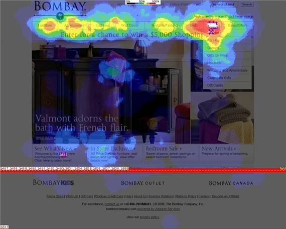
Jakob’s Nielsen Norman group has recently added eyetracking to its usability arsenal. If ever you’re looking for justification for not using large graphics on a site, look (sorry, no pun intended) no further than eyetracking heatmaps. In session after session, users skirt around large graphic blocks, focusing their interaction on text and navigation. It can be a rude slap in the face for most graphic designers (there’s a rather amusing anecdote about one such encounter that happened at the session, and an example of the phenomenon I’m talking about, on my blog).

Experience, Not Exposure

In the session, Jakob tossed out a line, the import of which I’m not sure was fully appreciated by the audience. When responding to a question from the audience about the seeming contradiction between the need for building of brand exposure and best practices for usability, Jakob said that online, brand value is built through experience, not exposure.

Whoa! There’s a world of wisdom in those eight little words! Beneath them lies a whole different way of looking at online engagement. It sums up something I’ve been hammering away at for years now. A successful user experience builds brand equity in a way that hammering visitors over the head with Flash or streaming video never could. Every single thing on a Web site should have one purpose, to make that user experience more successful. If it’s there solely for the gratification of the designer, or the CEO, or the CMO, it’s there for the wrong reason. And before you dismiss this thought, saying it doesn’t apply to you, take a look at your home page and ask yourself, why are the elements that are on the page actually there? Think through the decision process that placed each element on the page. How present were users in the process? Who was asking them for their opinion?

User Success In Search

This is a best practice in any Web site’s design, but it becomes particularly true when looking at search-generated leads. Search visitors reek with intent. They are incredibly single-minded in their purpose. They’re looking for a clear path ahead to their intent, and they’ve cast the first few steps down that path through their search query. They’ve come to the site not because they’re engaged with your brand, although that may have helped sway them in your direction, but because they’re engaged with a task. Get between them and the successful completion of that task at your peril. Every time you throw something at them that’s not aligned to that intent, you decrease their chances for success, eroding the value of your brand in their eyes. If you make them wait 20 seconds for a Flash file to load, that’s 20 seconds of ticking on a time bomb that could blow your brand to smithereens. If you throw in a large stock photo with the typical generic smiling face that takes up 70 percent of your home page, you’re wasting prime real estate. But don’t feel bad, it happens to the best of us. At least Jakob practices what he preaches on his site. What would you see if you went to the home page of Enquiro? A generic smiling face. But I’m working on it!

Usability and Asinine Comments from the Bay

Had a chance to catch one day of Jakob Nielsen’s Usability Week in San Francisco. Yesterday, I sat in on the eyetracking session and saw the results of the Nielsen Norman’s just completed study (numbers are still being crunched as we speak).

It was heartening to see that many of their findings mirrored our own, including F shaped scanning patterns, quick scans of pages and aversion of ads and large graphic blocks. It was in this last category that the asinine comments part comes (that’s why you’re really reading this, isn’t it?).

Jakob was demonstrating interaction with the home page of jcpenney.com. (The picture that I’ll be talking about has changed, but the basic page structure is the same). The heat map image showed clearly that the big block graphic, in this case a picture of a bed with a colorful spread, with some promotional text inset in the upper left and the lower right, received virtually no scanning. All the scanning was in the top navigation bar. The large block graphic “fenced in” the scan area, cutting users off from other promotional information that lay below the graphic. We saw the same thing occur with the Bombay Company site in a eyetracking study we did for MarketingSherpa (see below).

bombays

Some hot shot designer in the room decided to take exception with the proof in from of him, and called out some of the examples that Jakob has shown of large graphics that had received no scanning. He used words like apex composition and other regurgitated terms from a graphic design university text book to show that all the sites adhered to basic design principles and that the theoretical composition of the JCPenney picture was in fact spot on, drawing the eye from one promotional headline to the next. Jakob patiently pointed out the obvious, that the theory breaks down, because as the heat map clearly showed, no eyes were even being attracted, let alone drawn to any headlines. We settled back in our chairs, silently cheering the adroit handling of the blow hard in the back. Much to our amazement, the guy wouldn’t give up, continually going back to the point that the theory is right and works, despite evidence on a screen roughly 40 by 30 feet to the contrary. The mic finally had to be taken away from him.

A couple points here. Theories are theories, not fact. Heat maps are facts, at least for the sample of people in the study. And while you may argue that a sample of a couple hundred (the n of the NN/g study) isn’t representative, I would disagree. We’ve done enough to know that consistent behavior in eyetracking starts to emerge at about 10 people, then defines itself very clearly at 20 to 30 people. So designers, you just may have to forget everything you learned, because the way people interact with information is changing faster than new theories can be created. You have to keep an open mind.

Second of all, this guy was approaching this from a print paradigm, not an online one. His spouting of picture composition and eye flow comes from centuries of guessing about how we look at images. I remember talking to a university arts professor once who was really excited about eye tracking because we could finally find out if all the “crap that’s been spouted about how we look at paintings is even true or not”. I’m not saying century old principles are wrong, but you have to consider them in the appropriate context. Take our J.C. Penney picture. Mr. Design Dictionary is correct. The flow of the bed spread and the contours of the bed should hypothetically draw the eye from one headline to the other, if the eye entered the picture in the first place. In the print advertising world, photos act as an attractor. They grab the person who is reading adjacent, usually non relevant content, and pull them over to the ad. They are the entry point. If they do their job efficiently, you have altered the intent of the prospect. They have switched from reading a story to looking at your ad. The job of the photo is to channel this new intent to the right place.

With a website, you have the full intent of the user. That’s why they came to your site. A large block graphic gets in the way of that intent, and will be thin sliced out of the way. Worse, it could block the user from seeing the content on the site that they’re there to see. All the composition theory in the world won’t prevent that. Jakob’s point wasn’t that the picture was composed incorrectly; it was that the picture was a waste of valuable home page real estate.

Probably the most valuable thing I took from yesterday was a comment Jakob made as an aside. Branding online comes from the experience, not the exposure. This was in response to another comment somebody made about large graphics being present for branding purposes, and the seeming contradiction between the need for branding and best practices for usability. Online, a successful brand engagement and a successful user experience are the same thing. If you deliver efficiently on a user’s intent and make their online experience a pleasure, you will build more brand equity than you could ever build with gratuitous flash files, streaming media and huge graphics. The two aren’t mutually exclusive, but all too often online, the designers win at the user’s expense.

RSS Feeds vs E-mails: More Eyetracking Data from Jakob Nielsen

Jakob Nielsen’s Neilsen Norman Group just released an eyetracking study looking at scan patterns of e-mail newsletters vs RSS feeds. The summary results? People spend more time scanning newsletters, but are ruthless in scanning titles that pop up in their newsreaders. Again, both Jakob’s studies and ours seem to keep coming to the same conclusions, we’re evolving a very advanced form of “thin slicing” when we interact with information online. We have to, as there’s an overload of stimuli. I’m heading down to San Francisco next week to spend some time at Jakob’s usability summit, and hope to chat with him more about this.

Google, Microsoft, Print, TV and other Thoughts on a Rainy Day

It’s raining and I’m not feeling particularly industrious, so I’ll push back the “To do” pile a little bit farther and catch up on some blog posts.

There’s been a lot of buzz lately about the search engine’s foray into the world of print advertising, and Tacoda CEO Dave Morgan tries to pinpoint where Google’s attempt to introduce an auction based model to print could have gone wrong.

One point put forth in the column (although not Dave’s) that’s worth considering is that an auction based market is a tremendously efficient one. It has little overhead and it allows prices to find their own sustainable levels, based on the value in the buyer’s mind. This worked well for search because it presented untapped value. There was no place for search to go but up. Which it did.

Print is another matter. It represents an entire food chain with an accompanying industry that subsists on it. That comes with built in inefficiencies and therefore, pricing inflation. Arguably, when introduced to an open, dynamic, buyer controlled pricing market, print had nowhere to go but down. Which it did. And that was the problem.

But Dave points to another issue, and that’s the significant differences between print and search. Search is driven by intent, which means that search interactions generally lead to a purchase event in the not too distant future. And each click is an expression of that intent, which makes it easy for markets to start assessing value to the click. This measurable value provides easy justification for the bid price. In fact, it’s this direct response approach to search that’s introducing many of the challenges we face in trying to quantify value to search touch points as we move further away from the purchase.

Print is a different animal. It’s often used for branding, a much less quantifiable objective, and it’s not clickable. There’s no way to immediately and easily assign value, which makes bidding a guessing game at best, rather than a provable strategy.

In the end, it comes to down to a number of factors, including underestimating the inertia of the print market, the fact that in a price inflated market, an auction based model will find efficiencies, not profit, and, once again, Google thinking that as soon as they enter a new market and affix a Google label, the world will change rotational direction to accommodate them.

And yes, there is a theme emerging in my posts. I’m not a Google basher. I like much of what they do, I like their cocky optimism, I love what they’ve done for search and deep down inside, I do hope they reinvent at least part of the way we do business (nods to John Battelle) but the fact remains that I don’t agree with their strategy of attacking everything at once. It’s not sustainable.

I was in an interesting conversation yesterday with a multi year veteran of the technology wars. He said that Google takes a typical engineer’s view of the universe, and that is in any model, including business models, the more points you have between the producer and the end consumer, the more friction that is introduced. Google’s view is that friction is inefficient and should be eliminated, disintermediated, freeing the flow to go direct. Other companies, through long experience, including Microsoft, have learned differently. Friction is good, friction is valuable, and friction is inevitable in a world populated by people, not machines. Each friction point is an opportunity to add value.

With the two different views of the universe, it’s interesting to note that Microsoft is looking to enter the offline world as well. They announced that their vision of adCenter is a multi channel platform, that will introduce an auction based model and search like accountability to other channels, including television and print. Boy, if you thought print was a tough model to crack, wait til you take on television! Google’s problem, says Microsoft, is that they didn’t understand the print medium. By the way, in this story near the bottom there’s a really interesting line that speaks of many blog posts to come:

Bradford also indicated that Microsoft was gearing up to compete with Google for employees. She said Microsoft hopes to lure staff from Google when the company’s stock options begin vesting next year.

But another post, another day.

I don’t disagree with introducing efficiencies in the ad buying market. I believe it’s long, long, long over due. And I love the idea of introducing more accountability. But everyone has to understand going in that this means the tearing apart of an existing and considerable power construct (or several) and reinventing from the ground up. That takes time and resources. It takes patience. It takes adoption. Each of these speaks to a strategy that will take a considerable time for execution and to turn a profit. The fact that everyone is jumping on the Google print experiment (including Google themselves) because it wasn’t profitable out of the gate is a little ridiculous. Did Google really think they were going to change the world that quickly? Did the analysts? Did we learn nothing from the Dotcom bust?

Speaking of Google and TV, there’s an interesting column over at iMedia by Alan Shulman about the Googleization of TV. Check it out.

Okay, the rain is stopping, I thinned a few items out of my “blog fodder” in box, my “To do” pile is inching closer and the hordes are starting to gather at my door. Time to get back to work!

American “Idol”izing Google Trends

First published June 8, 2006 in Mediapost’s Search Insider

Let me apologize right off the bat. I’m going to jump on a pop culture bandwagon, but I’m doing it to prove a point. Search trends reflect the interests of our society, and they can provide an invaluable way to gain intelligence about what’s on the public’s mind.

First of all, some facts to consider:

  • The most votes ever cast for a presidential candidate were 54.5 million, for Ronald Reagan in 1984.
  • On Wednesday, May 24, 63 million votes were cast in the final voting episode of “American Idol”
  • All votes for “American Idol” were cast in a 2-hour window. Typically polls are open for most elections for 13 hours, not including advance polling.
  • In “American Idol,” there was not one hanging chad.

Obviously, “American Idol” struck a chord with the public this year. Some say the final choice of Taylor Hicks was a surprise, but was it? With the help of Google Trends, I did a little forensic investigation and charted the rise in popularity of the contestants, as captured on Google.

A couple of caveats. Total search volumes are an approximation, as Google Trends doesn’t show actual numbers, and currently Google is only showing trends up to the end of April. But as you’ll see, for the purposes of this column, that’s enough.

I divided the contestants into three groups based on indicated search volumes: the Front Runners, the Also-Rans and the Basement Dwellers. I’ve included a link to the chart for each.

The Front Runners

Taylor Hicks started the strongest out of the gate, dominating search volumes in February during the early rounds. Although he lost ground to Kellie Pickler and Chris Daughtry in March, he came back strong in April, only being edged out in total volume for the month by Kellie, due to a surge in searches the week she was voted off.

Pretty boy Ace Young was No. 2 in February, but lost steam moving into March and never seemed to recover. Chris Daughtry was a slow starter in February, but built steam through strong performances in March. Unfortunately, he seemed to lose his edge in April, as search volumes started to drop from their high in mid-March.

The sleeper in this group was Katherine McPhee, who slowly built up steam through late February, March and April, with a huge peak towards the end of April.

If one was to predict outcomes based on search trends from February through April, I would have called it this way

1. Taylor Hicks

2. Katherine McPhee

3. Chris Daughtry

4. Kellie Pickler (one has to adjust for the spike on the week she was voted off)

Remember, this was almost a full month before the final show.

The Also-Rans

In the middle of the “Idol” pack was a group that just couldn’t seem to spark the interest of America, despite significant talent.

  • Lisa Tucker started off the strongest of the group, but could never seem to rise above the search volumes generated mid-February. There was no “buzz” around her. Kevin Covais, on the other hand, emerged out of nowhere and did build through February and March. It’s also interesting to note that when many of the contestants were voted off, their search volumes dropped off the Google trend radar. However, Kevin was voted off March 22, but kept showing up well into April.
  • Diva Mandisa started from nowhere, but generated some of the highest search volumes of all on the night she was voted off. Sometimes you don’t know what you’ve got till it’s gone. And poor Elliott Yamin didn’t have a chance. Despite a great voice (maybe the best, if you believe the judges) he just didn’t turn America’s crank. Although he built search volume slowly, he never emerged as a contender.

The Basement Dwellers

The three who were certified “buzz”-less were Paris Bennett (maybe she should change her name to Hilton), Bucky Covington and Melissa McGhee.

Paris started off hot right out of the starting gate in January, but never went anywhere from there. It seems we got used to the dynamic vocals, the pixie-like speaking voice and the cool hats–and ceased to care. Bucky and Melissa really only attracted significant volumes on the days they were voted off.

The point of this exercise is this. Search volumes do mirror public opinion, and can act as an amazingly accurate indicator of our collective interests. If you would have had access to search volume information, you could have called the results of “American Idol” long before the final show.

The other thing that was interesting was to see the power of community, both in the search results and the actual results. When you look at the top locations for searching, they are, in order: Greensboro, N.C., Charlottesville, Va., Raleigh, N.C., Charlotte, N.C. and Atlanta.

The North Carolina contingent was incredibly active in its quest for information on Chris, Kellie and to a lesser extent, Bucky, far out-searching the rest of the country for those individuals. The search demands for Taylor, Katharine and Ace were spread evenly throughout the country.

If you haven’t played with Google Trends yet, give it a spin. It can provide a fascinating glimpse into search buzz, and through it, what’s on our collective minds at any given time, on any given subject.

Engagement with Video Online

In the past week I’ve read a number of articles precipitated by Google’s move to show video ads across their network. The introduction of video to online seems to be heralded as “the next big thing” by almost everyone, and I admit I’ve taken a turn on that particular band wagon.

Yet, this weekend, I pondered the nature of our engagement with online video and find it wanting in many respects. Why? The particular event that triggered this train of thinking was my trying to watch the documentary “Loose Change” on my computer. If you haven’t seen the video, it’s a Michael Moore-ish type investigation of the events of 9/11. Whether you believe it or not, there’s little doubt that the subject matter is engrossing. I watched Bowling for Columbine and Fahrenheit 911 on my television and had no problem watching them in one sitting. I was highly engaged and was pretty much oblivious to other distractions, including children.

With Loose Change, I’ve been trying to watch the documentary for 2 months now, and I’m only half way through it. It’s not that it’s less interesting. It’s that my environment is different.

When we sit at a television, we’re used to being passive. I think the past 50 years have conditioned us to expect to relinquish control and be willing sponges for whatever happens to flash on the screen. Recently, remote controls and DVR’s have given us some degree of control over the box, but we’re just beginning to exercise that control. When we sit down in front of a TV set, we’re not expecting to “do” anything with it.

The other place where we tend to watch sights and sounds is the movie theater. Again, we expect to be a passive audience here.

But when we sit in front of a computer, we usually do so to accomplish a task. It’s the most useful box in the house, and I believe it’s this very usefulness that may be keeping video from being more engaging online.

Look at the videos that tend to be watched online. They’re short, they have to be highly stimulating and we usually only watch them because a trusted source has labelled them a “must see”. Either a friend has emailed us a link with their recommedation, or word of mouth has spread about the video and it’s the latest viral craze. And usually they require no intellectual engagement. The most watched clips on YouTube fit these criteria to a T. #1 is the Evolution of Dance, watching a (undoubtedly talented) comedian morph from one dance to another in 5 minutes. #2 is a lip sync done in a bedroom of two teenagers in an ode to Pokemon. And #3 is the live version of the Simpson’s intro. Production values are usually minimal, and there is no intellectual content. There is a kind of counter-culture, anti establishment feel to them, which probably adds to their viral appeal.

If a video meets all these criteria, then it will be watched online.

Now, what do we do with our computer, whether it be a laptop or a Media Center, if we want to watch a show on it in the same manner as we would on TV?We maximize the window, blocking out the other stimuli and making it a TV set.

Let’s go back to Loose Change. While arguably this has been a viral success online, it has still been a struggle for me to watch. Why? Well, it’s long, at an hour and 20 minutes. It’s online resolution forces me to watch it in a window, with other stimuli surrounding it. And I have to think and absorb, it’s not mindless.

When I’m watching a video in these circumstances, I find it very difficult not to be distracted by what surrounds it on the page. I feel this innate guiltiness, thinking that there are a hundred other useful things I should be doing rather than watch this video. In fact, we have been conditioned to consider watching a video as a “waste” of time. We can justify it if it’s a few short minutes out of our day. It’s mindless entertainment. But otherwise, guilt starts eating at us. An inexplicable anxiety starts, with the feeling that there has to be something more useful to do with my computer.

Back to my original point. I think we have to reinvent the paradigm through which we engage with video online. I don’t think moving the types of videos we used to watch on TV to our computer screen will work. And my prediction is that advertisers will spend millions of dollars to discover this. Probably the biggest success online has been the Subservient Chicken for Burger King. And the key? It’s different, and it’s interactive.

With Google’s announcement, there will be many who throw video online, in the assumption that it will be more engaging than a simple graphic ad, or even a text based ad. Don’t count on it. The rules are different, and they’re still being written.

What Sport Rules on Search?

I’ve been meaning to post on this for awhile, but you know how things go.

Anyway, Google Trends is pretty fun to play with. Being in Canada in hockey playoff season, I thought it would be interesting to compare the big 4 sports in North America.

Here’s the results:

So…over all Football rules in terms of search volume, with very regular peaks in basketball during playoffs.

On the top graph, hockey doesn’t look too impressive, but check out the search volumes in the cities. Hockey rules! Even in Minneapolis, the lone US city to make the list, they’re still looking for hockey. To be honest, we consider Minnesotans honourary (notice the Canadian spelling?) Canadians anyway.

Winnipeg is die hard hockey heartland, and they haven’t had a NHL team in 10 years (the Jets moved to Phoenix and became the Coyotes).

I’m not sure whether to be proud of our national obsession, or a little embarassed.

And in the interest of being topical, here’s how searchers cast their votes in April (the latest month available) for American Idol contestants. Hmm..this was almost a full month before the finals. Could search be the crystal ball for reality TV?

Relevancy Rules in Sponsored Search Ads

First published May 4, 2006 in Mediapost’s Search Insider

Let me quote some rather startling numbers to you from a recent eye tracking study we did. In the study, we examined where people first looked on a search results page, where they first scanned a listing, and where they eventually clicked.

First of all, we gave participants a number of different scenarios that involved looking to a search engine to help them make a purchase. We used Google, Yahoo and MSN in the study. In all cases, on all 3 engines, the vast majority of people first glanced at the top- sponsored listings. In eye tracking parlance, we call this a fixation, or a momentary pause of the eye. On Yahoo, 84 percent of the first fixations were on the top sponsored listings when they appeared, on Google it was 81 percent, and on MSN it was 87 percent. So, almost nine out of every 10 people start looking at the search results page by at least glancing at the top sponsored listings

The next thing we measured was active scanning. This is where participants started reading a listing. On Google and Yahoo, there was strong correlation with the first fixation point, with 79 percent of the first reading activity on top sponsored for Yahoo, and 71 percent for Google. MSN was another story. While 87 percent of participants first glanced at the top sponsored ads, only 55 percent started reading there. Almost 32 percent of our participants immediately relocated past the sponsored ads.

Finally, we recorded where the eventual clicks happened. In Google’s case, 26 percent of the clicks happened in the top sponsored ads, with Yahoo it was 30 percent, and MSN came in with 17 percent click through on top sponsored.

Here’s what we took from the numbers. On Google, although over 80 percent of searchers started in the top sponsored, only 26 percent found something relevant and compelling enough to click on, and remember, these were commercial, product oriented searches. On Yahoo, 84 percent started in top sponsored, but in Yahoo’s case, about 30 percent stuck around and clicked an ad. And with MSN, something entirely different was going on. It seems that MSN users have a bad case of banner blindness when it comes to top sponsored ads.

Scanning Follows Relevancy

The reason top sponsored ads are effective is because they’re placed in the highest traffic portion of the page. We orient ourselves in the page on the upper left. Our destination is the top organic ad. Top sponsored ads are placed in the middle of the most popular real estate on the SERP. This is shown by the high percentage of fixations that happen in this section.

But our interactions with the SERP are not all about position. We can, very quickly, determine if what’s there is relevant to what we’re looking for. We quickly scan titles to see if the ads presented match our intent. And when I say quickly, I’m talking fractions of a second. We start picking up relevancy without even having to read the listings by determining scent. If the listing has “scent” and it’s a good match, we’ll not only hang around and start scanning the listing, we may even click on it. Otherwise, we do what we intended to do in the first place and skip down to the organic listings. That’s what’s happening on Google and Yahoo. MSN is another story.

The MSN Two-Step

During the study period, MSN was in experimentation mode. It was in the process of dropping Yahoo ads from the top listing and substituting its own advertising, which in most cases wasn’t keyword-driven to the same extent that the Yahoo ads were. This usually meant that the “scent” or relevancy match wasn’t as great. When this happened, we saw almost immediate relocation down to organic results. Users could determine the existence, or in this case, absence of scent in a fraction of a second and relocated down. In effect, it was an example of banner blindness, where they were determining that the top sponsored results weren’t relevant.

The lesson from this for the search engines is that you can’t take position for granted. You have to deliver with relevancy and the greater the relevancy, or at least, the perceived relevancy, the better those top sponsored ads will perform.

Yahoo’s Relevancy Capitulation

Yahoo has learned this over time. In the beginning days of GoTo/Overture/Yahoo, position was determined solely by bidding. When Google came on the scene, it offered a blended approach, where click-through rates also helped determine position. The theory was, the higher the click-through rate, the greater the relevancy.

Yahoo has recently announced integrating click through rates and relevancy into the sponsored positioning algorithm as well. This is the beginning. Soon, message and landing page relevancy will also be factored into the position equation.

When it comes to capturing a searcher’s click, you have to deliver relevancy. It’s not all about position–and this fact will become more true in the future, not less.