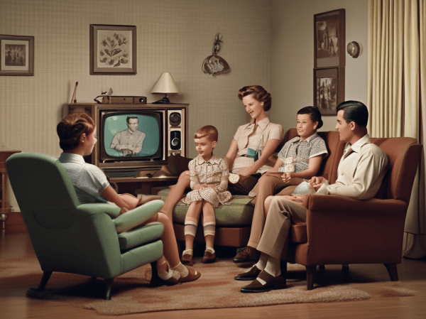
The Psychology of Entertainment: Our Need for Entertainment

Anytime we talk about human behavior thats triggered by the equipment we all ship with – namely our brains-we have to account for variations in how that equipment operates. We are not turned out by assembly line, with quality control measures insuring that all brains are identical. Each brain is distinct, formed both by our own genetic signature and by our environment. While variation across the human genome is remarkably minor, we are all products of bespoke design – handcrafted to make us uniquely us.

Distribution of Our Uniqueness

Snv
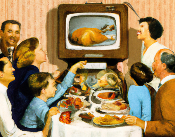
This variation typically plays out in a normal distribution curve, more commonly known as a bell curve. Most of us cluster towards the center – the norm. And as we move out from the center, venturing one or two standard deviations from the norm into outlier territory, our numbers drop dramatically.

If we talk about the phenomenon of entertainment, we are definitely talking about how our brains operate. This means that we could expect to find a normal distribution in attitudes towards entertainment, with a peak in the middle and rapidly descending slopes on both sides. For example, one would expect such a distribution in the types of entertainment we prefer: the books we read, the shows we watch, the music we listen to. in fact, with a little statistical origami, we can do a quick check on this. Take a standard distribution curve and fold it in half along the “norm” line (shown as 0). The shape should look familiar. We have Chris Anderson’s Long Tail. The similarity of tastes close to the norm accounts for blockbusters and best sellers. These are the forms of entertainment that appeal to the greatest number of individuals. More esoteric entertainment tastes live well down the curve, in outlier territory.

Long_Tail

The Need for Entertainment Scale

I’ll come back to the types of entertainment we prefer and why in a later post. Today, I want to concentrate on another variable in the human psyche that also can impact our engagement with entertainment: how much do we need to be entertained? Why are some of us drawn more to fiction and others to non-fiction. Why do some of us like the escapism of a TV sitcom and others prefer to watch the news? Why do some of us have 5 TV’s in our house, with hundreds of digital channels, and others have none? What does the normal distribution curve of our need for entertainment look like. That was exactly the question that Timothy Brock and Stephen Livingston from Ohio State University tackled (The Psychology of Entertainment Media: Blurring the Lines between Entertainment and Persuasion. Publisher: Lawrence Erlbaum Associates. Place of Publication: Mahwah, NJ. Publication Year: 2004. p 255-268).

The need for entertainment seems to be almost addictive in some cases. In the study, Brock and Livingston restrict their definition of entertainment to passive consumption of some form of entertainment, either TV, radio, film, print, theatre or sport spectacles. Of these, television is the most common, so many of the measures revolved around our relationship with that specific entertainment medium. I’ve talked before about the impact of TV on society, but some of the empirical research on our reliance on the tube is astounding. In 2002, Robert Kubey and Mihaly Csikszentmihalyi found troubling evidence of a true biological addiction to TV:

“To track behavior and emotion in the normal course of life, as opposed to the artificial conditions of the lab, we have used the Experience Sampling Method (ESM). Participants carried a beeper, and we signaled them six to eight times a day, at random, over the period of a week; whenever they heard the beep, they wrote down what they were doing and how they were feeling using a standardized scorecard.

“As one might expect, people who were watching TV when we beeped them reported feeling relaxed and passive.

“What is more surprising is that the sense of relaxation ends when the set is turned off, but the feelings of passivity and lowered alertness continue. Survey participants commonly reflect that television has somehow absorbed or sucked out their energy, leaving them depleted. They say they have more difficulty concentrating after viewing than before. In contrast, they rarely indicate such difficulty after reading. After playing sports or engaging in hobbies, people report improvements in mood. After watching TV, people’s moods are about the same or worse than before.

“Thus, the irony of TV: people watch a great deal longer than they plan to, even though prolonged viewing is less rewarding. In our ESM studies the longer people sat in front of the set, the less satisfaction they said they derived from it. When signaled, heavy viewers (those who consistently watch more than four hours a day) tended to report on their ESM sheets that they enjoy TV less than light viewers did (less than two hours a day).

What value do we place on the ability to watch TV? Brock and Livingston gave 115 undergrads two scenarios. In the first, they could correct a hypothetical mix up in their official state citizenship in return for a one time cash gift. The undergrads were asked to put a value on changing their official allegiance from one state to another. 15% would do it for free and another 40% would do it for under $1000.

The next scenario asked the students what compensation they would require to give up TV for the rest of their lives. A permanent tracking implant in their ear would notify a monitoring service if they cheated and the entire gift would be forfeited. 8% were willing to do it for free, but over 60% would need at least a million dollars to give up TV forever.

Findings: Men Need More Entertainment & The More You Think , The Less You Need to Be Entertained

In their scale of the need for entertainment, Brock and Livingston assessed three factors: Drive (how actively do you pursue passive entertainment?), Utility (how useful is passive entertainment, both to you specifically and in general?) and Passivity (how active do you like your entertainment to be?).

So, how do we fare on our need to be entertained, based on Brock and Livingston’s scale? First of all, men seem to have a stronger drive to be entertained than women. Males scored higher on the amount they spend on entertainment, the daily need for entertainment and the inability to function without entertainment. One would assume that the “couch potato curve” would skew to the male side of the demographic split.

Also interestingly, Brock and Livingston found an inverse relationship between the need to be entertained and the “need for cognition” – a measure of how much people like active problem solving and critical thinking. Again, the more you think, the less reliant you are on TV.

In a follow up study, Brock and Livingston tried to draw a defining line between entertainment (in their definition, passive consumption) and sensation seeking. I’ll touch on this in tomorrow’s post.

The Psychology of Entertainment: How Our Brains Connect with Stories

Andi Bell has an amazing memory. In fact, if you shuffled together 10 decks of cards, put them in front of Andi and gave him 20 minutes, not only would he have memorized every single card in the pack, he would have memorized them in order. 520 cards, and Andi will remember every suit, every value and what order they came in. It’s a feat that boggle the everyday mind. Andi, however, has a secret. And that secret is the power of narrative. We love a good story!

As I mentioned last Friday, I want to explore the psychology of entertainment a bit more today as we explore it’s role in marketing. In a post last week, I said that audience patterns have to establish some stability before we can effectively market to them. We have become a society of early adopters, or, at least, marketers treat us as such. Because we are continually rushing from bright shiny object to bright shiny object there is tremendous churn in most online audiences. I called it “chasing Digital Fluff”.

Keeping Your Audience in One Place

But what could create the audience stability I’m talking about? I put forward usefulness as one element. In a comment, Lance Loveday also suggested entertainment value. I found this intriguing, but of course, Lance’s suggestion also raised a number of  questions for me. What represents “staying power” in entertainment? Why are some entertainment channels fads and some long enduring trends? How do our brains respond to entertainment? What is the difference between a TV show and a video game, for instance? What is it about entertainment that makes it so…well…entertaining? And finally, is Lance right? Will the entertainment factor be enough to move some digital channels from fad to trend? And, if so, where should we place our (or more correctly, our client’s) bets?

Today, I want to begin by exploring how we respond to what seems to be the oldest form of entertainment in the world: stories. We humans have a deeply wired connection with stories. I suspect that as soon as humans began communicating, we began telling stories. In fact, stories are so important to us, it appears that we have a special channel in our brains to interpret stories – evolution has equipped us with a specialized story processor. And it’s this story processor that Andi Bell uses to memorize 10 packs of cards. Bell discovered the power of the story processor, what he calls the Linking Technique, and it made him the three time World Memory Champ.

How to Memorize 520 Playing Cards – Tell 1 Story

The human mind never evolved to deal effectively with random facts. Our brain does not deal that well with the abstract. That’s why we invented writing, symbols, alphabets and math. These are the ways we take the non-concrete and manipulate them for our use. The world of our ancestors tends to play out in much less abstract terms: Where is food? Where is water? What happens when I sleep too close to predators? What happens when I steal my neighbor’s dinner? What happens when I overstep the boundary between my tribe and the neighboring tribe?

These were the realities of our ancestor’s lives and, as such, our brain evolved native mechanisms for dealing with these realities. The ability of our brains to navigate through an physical environment or to remember parables (which are nothing more than behavioral reinforcing stories) is highly developed. But in this world, our evolutionary environment, the abstract mechanisms we take for granted may be completely absent. For example, many primitive tribes have no numbering systems, or, if they do, they may be limited to three words: one, two and many. We can remember how to navigate through hundreds of places we’ve been before, or we can remember the important details of thousands of stories, but remembering a phone number consisting of just 7 or 10 digits can be a challenge. It’s not because we’re addle minded, it’s just because our brains use different mechanisms.

Andi Bell discovered this and found a way to link the abstract to the more highly evolved memory modules of our brains: our on-board navigation computer and our capacity for remembering a story.  Bell’s technique is fairly simple. In his mind, he has a standard route imagined through his home town of London, England. He’s memorized the route in detail. That’s the first step. The second step is to create a story that plays out along the route. Here, he takes each card in a standard deck of cards and creates an imaginary stand-in for it. He replaces abstract numbers and symbols with concrete images from the real world. The 8 of clubs could become a brown bear. The 3 of diamonds could become a pineapple. These become the “characters” of a story imagined on the fly. 520 random cards becomes 520 elements in a story spread through the streets of London. To recall all the cards, Andi has to follow the route through London, retelling the story as he goes. Bell’s technique is not new. It’s called the Method of Ioci, otherwise known as the Memory Palace, and was used by the ancient Greeks and Romans.

Why do stories seem to have a more direct path to our memory? What is it about the power of a story that’s so compelling to humans? Whatever it is, Malcolm Gladwell is a master of the power of a story and it’s kept him on top of the best seller list for several years now.

Gladwell’s Secret for Writing Bestsellers

Writing non-fiction is a challenge. It almost always involves the writer getting a bunch of facts or opinions from their head onto paper. That in itself is not a challenge. But getting facts into a form that is compelling to read is. But at least with facts, the writer can choose interesting ones. Opinions offer even more of a challenge. We are naturally suspicious of other people’s opinions. They have to pass through the filter of what we ourselves believe in. So how does the non-fiction writer take this unwieldy bucket of fact and opinion and craft it into something that someone else will want to read? How do you write a non-fiction best seller?  With half a million books published every year (and that’s just the ones we can keep track of), there is an extraordinarily long tail in book selling.  The 100 best selling non fiction books of 2009 represents just .02% of all books published, yet represent a huge chunk of the revenue. If there is a magic formula to making this list, Malcolm Gladwell seems to have found it. Right now, Gladwell has 2 of the 15 top selling non fiction books on the New York Times best seller list – Outliers and What the Dog Saw. Gladwell’s Blink and The Tipping Point were perpetually on top of best seller lists for the better part of the last decade. So, what’s Gladwell’s formula?

Like Andi Bell, Gladwell has discovered the power of narrative and it’s appeal to humans. Malcolm Gladwell collects social observations, both through his experiences and that of his network of friends. When he uncovers a compelling question, he first goes to his collection of observations and then, with a journalists instincts, he uncovers the stories behind the observations and tells these stories with a lucid, clear style. He lets his stories make his point for him, rather than pad his narrative with reams of opinionated rhetoric. Gladwell’s style is irresistibly compelling, making him the most successful non-fiction writer of the last decade.

How We Process a Story

So, why is a story so much more compelling than facts that are simply strung together. Why does Gladwell go to the trouble of finding the stories to illustrate his questions, essentially creating a scientific and sociological “whodunnit” (and in this case, the answer to who is always the same – we did it)? Well, for one thing, the basic premise of any Gladwell book could probably be told in 500 words if all the stories were stripped away. But then, no one would read those 500 words, would they? And additionally, stories make things stick in our brains. We are more accepting of a story and we remember it better. As with memory, our brains were built to accept stories.

There is empirical evidence (Prentice and Gerrig, 1999) that we process narrative differently than we do simple factual rhetoric. Narrative slips in through a different window, one more aligned with the physical world around us. We imagine ourselves experiencing the story. There are concrete hooks in our mind that we can hang the story on, making it more relevant to us. We become engaged with characters in the story. Gladwell wisely adds a generous helping of personal detail about the central characters in his story, as in his compelling description of Lois Weisberg in the Tipping Point :

loisLois (everyone calls her Lois) is invariably smoking a cigarette and drinking one of her dozen or so daily cups of coffee. She will have been up until two or three the previous morning, and up again at seven or seven-thirty, because she hardly seems to sleep. In some accounts — particularly if the meeting took place in the winter — she’ll be wearing her white, fur-topped Dr. Zhivago boots with gold tights; but she may have on her platform tennis shoes, or the leather jacket with the little studs on it, or maybe an outrageous piece of costume jewelry, and, always, those huge, rhinestone-studded glasses that make her big eyes look positively enormous.

Gladwell has conjured an image of Lois in our minds. To make his point, which is that the make up of most social networks include hyper connected hubs like Weisberg, Gladwell invests hundreds of words in creating a vivid profile of her. Why? Because it makes it more real to us. It turns a simple observation – our networks contain super connected hubs – into a story that engages us at a totally different level. We drop our rational guard and allow ourselves to become part of the story. In doing so, he avoids that trap that keeps most non-fiction off the best seller list – he knows that best way to inform is to entertain.

So, we’ve learned that entertainment works best when it slips past our rational processing mechanisms and hits a more concrete, ancient part of our brain. There needs to be ease of access by respecting what our brains were built to do. Tomorrow, I’ll pick the thread up again when I continue to look at the psychology of entertainment.

Everyone’s a Critic: The Splinters of our Discontent

First published January 14, 2010 in Mediapost’s Search Insider

I had a bout of inbox convergence today. Just as I was speculating what this week’s Search Insider might cover, two separate emails surrounded a juicy little topic and delivered it to me on a platter. First, a post from Ad Age about how marketers are reluctant to use online conversations as a source of customer feedback: “‘Listening’ ostensibly has become the rage in consumer research, but the Advertising Research Foundation is finding that many marketers view what would seem one of the digital age’s biggest gifts to marketers — the torrent of unsolicited consumer opinion — as more of an added expense item than a blessing.”

And then, a small blog post on Echouser got me thinking: “It’s a concept for what an iPhone app designed to measure experiences (any experiences, from surfing a website to hopping on BART) could look like… Can you imagine if we were able to rate experiences on the fly, all day every day?”

Customers are Talking…

There’s been a lot of talk about the shift of control to the consumer and empowerment. As 2009 drew to a close, I talked about the shape of marketing to come. One of the key foundations I identified was participation — actively engaging in an ongoing conversation with customers. The two posts in my inbox start to get at the potential of this conversation.

In the first post, ARF laments advertisers’ reluctance to tap into ongoing online conversations as a source of customer feedback. Valid point, but I can understand their reluctance. This is unstructured content, making it qualitative, anecdotal and messy. Marketers balk at the heavy lifting required to mine and measure the collective mood. Some tools, such as Collective Intellect, are starting to take on the hard task of migrating online sentiment into a dashboard for marketers. The easier it gets, the more likely it will be for marketers to actually do it. Until then, we’re stuck with consumer surveys and comment cards.

…Anytime, Anywhere…

But it’s the second post that really got me thinking. Always-on connections have already given a voice to consumers, one that’s heard loud and clear. But what if we did indeed have a convenient and commonly structured way to provide feedback on every single interaction in our lives through mobile connections? What if marketers could know in real time what every single customer thought of them, based on the experience he or she just had? Some cringe at the thought. Others are eager for it. The second group will inevitably prevail.

Given the level of investment required on the part of the user, I suspect this channel would only be used in extremely negative and extremely positive circumstances. We don’t tend to take the time to comment on things that come reasonably close to meeting our expectations. But even so, it’s a powerful feedback channel to contemplate, giving the truly user-centric company everything they could ever wish for.

…So Listen!

Last week, I talked about the mother lode of consumer intent that exists in search query logs and how we’ve been slow to leverage it. This week, we have an equally valuable asset rapidly coming down the pipe — a real-time view of our customers’ sentiment.  That’s a one-two punch that could knock the competition out cold.

How Our Brain Decides How Long We Look at Something

In this week, I’ve talked about how our attention focusing mechanism moves the spotlight of foveal attention around different environments: a Where’s Waldo picture, a webpage, a website with advertising and a search engine results page. I want to wrap up the week by looking at another study that looked at the role of brain waves in regulating how we shift the spotlight of attention from one subject to another.

Eye Spy

eyetrackingsaccadesIf you do eye tracking research, you soon learn to distinguish fixations and saccades. Fixations occur when we let our foveal attention linger on an element, even for a fraction of a second. Saccades are the movements our eyes make from one fixation to the next. These movements take mere milliseconds. Below I show an example of a single session “gaze plot” – the recording of how one individual’s eyes took in an ad (the image is from Tobii, the maker of the eye tracking equipment we use). The dots represent fixations, as measured in milliseconds. The bigger the dot the longer the eye stayed here. The lines connecting the dots are saccades.

When you look at a scene like the one shown here, the question becomes, how do you consciously move from one element to another. It’s not like you think “okay, I’ve spent enough time looking at the logo, perhaps it’s time to move to the headline of the ad, or the rather attractive bosom in the upper right corner (I suspect the participant was male)” The movements happen subconsciously. Your eyes move to digest the content of the picture on their own accord, based on what appears to be interesting based on your overall scan of the picture and your attention focusing mechanisms.

Keeping Our Eyes Running on Time

Knowing that the eye tends to move from spot to spot subconsciously, Dr. Earl Miller at MIT decided to look closer at the timing of these shifts of attention and what might cause them. He found that our brains appear to have a built in timer that moves our eyes around a scene. Our foveal focus shifts about 25 times a second and this shift seems to be regulated by our brain waves. Our brain cycles between high activity phases and low activity phases, the activity recorded through EEG scanning. Neurologists have known that these waves seem to be involved in the focusing of attention and the functions of working memory, but Miller’s study showed a conclusive link between these wave cycles and the refocusing of visual attention. It appears our brains have a built in metronome that dictates how we engage with visual stimuli. The faster the cycles, the faster we “think.”

But, it’s not as if we let our eyes dash around the page every 1/25 of a second. Our eyes linger in certain spots and jump quickly over others. Somewhere, something is dictating how long the eye stays in one spot. As our brain waves tick out the measures of attention, something in our brains decide where to invest those measures and how many should be invested.

The Information Scent Clock is Ticking

Here, I take a huge philosophical leap and tie together two empirical bodies of knowledge with nothing scientifically concrete to connect them that I’m aware of. Let’s imagine for a second that Miller’s timing of eye movements might play some role in Eric Charnov’s Marginal Value Theorem, which in turn plays a part in Peter Pirolli’s Information Foraging Theory.

Eric Charnov discovered that animals seem to have an innate and highly accurate sense of when to leave one source of food and move on to another, based on a calculation of the energy that would have to be expended versus the calories that would be gained in return. Obviously, organisms that are highly efficient at surviving would flourish in nature, passing on their genes and less efficient candidates would die out. Charnov’s marginal value calculation would be a relatively complex one if we sat down to work it out on paper (Charnov did exactly that, with some impressive charts and formulas) but I’m guessing the birds Charnov was studying didn’t take this approach. The calculations required are done by instinct, not differential calculus.

So, if birds can do it, how do humans fare? Well, we do pretty well when it comes to food. In fact, we’re so good at seeking high calorie foods, it’s coming back to bite us. We have highly evolved tastes for high fat, high sugar calorie rich foods. In the 20th Century, this built in market preference caused food manufacturers to pump out these foods by the truck load. Now, well over 1/3 of the population is considered obese. Evolution sometimes plays nasty tricks on us, but I digress.

Pirolli took Charnov’s marginal value theorem and applied it to how we gather information in an online environment. Do we use the same instinctive calculations to determine how long to spend on a website looking for the information we’re seeking? Is our brain doing subconscious calculations the entire time we’re browsing online, telling us to either click deeper on a site or give up and go back to Google? I suspect the answer is yes. And, if that’s the case, are our brain waves that dictate how and where we spend our attention part of this calculation, a mental hourglass that somehow factors into Charnov’s theorem? If so, it behooves us to ensure our websites instill a sense of information scent as soon as possible. The second someone lands on our site, the clock is already ticking. Each tick that goes by without them finding something relevant devalues our patch according to Charnov’s theorem.

The World’s Intentions at Our Fingertips

First published January 7, 2010 in Mediapost’s Search Insider

We’ve made Google a verb. What does that mean? Well, for one thing, it means we have a better indication of prospect intent than ever before. Google (or any search engine) becomes the connector between our intent and relevant online destinations. John Battelle called Google the database of intentions and predicted that it would become hugely important. Battelle’s call was right on the money, but we still haven’t felt the full import of it. Our tapping into our zeitgeist (defined as the general intellectual, moral and cultural climate of an era) is usually restricted to a facetious review of the top 10 search terms of the year.

Keep Your Eye on Intent

A couple of columns ago I indicated that consumer intent was one of the most important things to watch in the shift of advertising. Intention changes the rules of engagement with advertising. It switches our perception of ads from that of an interruption we’re trying to avoid to that of valuable information we’re looking for. With intention in place, the success of an ad depends not on its ability to hijack our attention, but rather on its ability to deliver on our intention. Ads no longer have to intrude on our consciousness; all they have to do is inform us.

To this point, some 15 years into the practice of search marketing, the majority of our efforts have been restricted to effectively meeting the intentions of our prospects. And, to be honest, we still have a long way to go to get that right. Landing page experiences still fall far short of visitor expectations. Search ad copy is still irrelevant in a large percentage of cases. Even when the keywords used give a clear signal of intent (unfortunately, a fairly rare circumstance) most marketers come up short on delivering an experience that’s relevant and helpful. Poor search marketing is the reason quality scores exist.

The Keynote Avinash Never Gave

But there’s an immense store of untapped potential lying in this “database of intentions.” When Avinash Kaushik did the keynote at last month’s Search Insider Summit, he intended to touch on three topics. Unfortunately, the third topic had to be dropped because of time limitations. He talked about attribution models and the Long Tail. The third topic was to be the use of search as a source of intelligence. Kaushik was going to explore how to leverage the “database of intentions” to better inform all our marketing efforts.

When it comes to tapping into this extraordinarily rich source of intelligence, even search marketers are slow to realize the potential. And we’re the ones that supposedly “get” the importance of search. For more traditional marketers, most are completely unaware that such a thing even exists. I believe two things are holding us back from effectively mining the “database of intentions” – the isolation of search marketing within an organization, and a lack of tools to effectively mine the intelligence.

SEM is an Island

Search marketing lives as an isolated island within most organizations. It lives apart from the main marketing department — as well as the day-to-day pulse of the corporation. The bigger the company, the more true this is. That means that the one department that has a hope in hell of understanding the importance of all these collected searches has little or no voice in the overall marketing strategy. All those signals of customer intent — indeed, the best barometer of consumer sentiment ever built — lies locked away behind the imaginary door of the search marketing cubicle.  The traditional marketing folks have no idea that this crystal ball, offering a real-time view of the goals, thoughts and aspirations of their target market, even exists, let alone how to use it.

Wanted: Better Mining Tools

Even the relatively minimal efforts Google has made to provide tools to dig into this data have proven to be amazingly valuable for marketers. Google Trends and its bigger brother, Google Insights, provide a glimpse into the power of Google’s query database. Unfortunately, these tools provide a rather anemic interface, considering the wealth of information that could be gleaned. Privacy is one stumbling block, but surely we could have more powerful tools to examine and slice the data, even in anonymized, aggregated form. I would love to hitch the sophistication of a comScore-type application to Google’s back-end data.

Battelle said this about the Database of Intentions:Such a beast has never before existed in the history of culture, but is almost guaranteed to grow exponentially from this day forward. This artifact can tell us extraordinary things about who we are and what we want as a culture.

Isn’t about time that we marketers clued into it?

How Our Brains “Google”

So far this week, I’ve covered how our brains find Waldo, scan a webpage and engage with online advertising. Today, I’m looking at how our brains help find the best result on a search engine.

Searching by Habit

First, let’s accept the fact that most of us have now had a fair amount of experience searching for things on the internet, to the point that we’ve now made Google a verb. What’s more important, from a neural perspective, is that searching is now driven by habit. And that has some significant implications for how our brain works.

Habits form when we do the same thing over and over again. In order for that to happen, we need what’s called a stable environment. Whatever we’re doing, habits only form when the path each time is similar enough that we don’t have to think about each individual junction and intersection. If you drive the same way home from work each day, your brain will start navigating by habit. If you take a different route every single day, you’ll be required to think through each and every trip. Parts of the brain called the basal ganglia seem to be essential in recording these habitual scripts, acting as sort of a control mechanism telling the brain when it’s okay to run on autopilot and when it needs to wake up and pay attention. Ann Graybiel from MIT has done extensive work exploring habitual behaviors and the role of the basal ganglia.

The Stability of the Search Page

A search results page, at least for now, provides such a stable environment. Earlier this week, I looked at how our brain navigates webpages. Even though each website is unique, there are some elements that are stable enough to allow for habitual conditioned routines to form. The main logo or brand identifier is usually in the upper left. The navigation bar typically runs horizontally below the logo. A secondary navigation bar is typically found running down the left side. The right side is usually reserved for a feature sidebar or, in the case of a portal, advertising. Given these commonalities, there is enough stability in most website’s designs that we navigate for the first few seconds on autopilot.

Compared to a website, a search engine results page is rigidly structured, providing the ideal stable environment for habits to form. This has meant a surprising degree of uniformity in people’s search behaviors. My company, Enquiro, has been looking at search behavior for almost a decade now and we’ve found that it’s remained remarkably consistent. We start in the upper left, break off a “chunk” of 3 to 5 results and scan it in an “F” shaped pattern. The following excerpts from The BuyerSphere Project give a more detailed walk through of the process.

searchheatmap11 – First, we orient ourselves to the page. This is something we do by habit, based on where we expect to see the most relevant result. We use a visual anchor point, typically the blue border that runs above the search results, and use this to start our scanning in the upper left, a conditioned response we’ve called the Google Effect. Google has taught us that the highest relevance is in the upper left corner

Searchheatmap22 – Then, we begin searching for information scent. This is a term from information foraging theory, which we’ve covered in our eye tracking white papers. In this particular case, we’ve asked our participants to look for thin, light laptops for their sales team. Notice how the eye tracking hot spots are over the words that offer the greatest “scent”, based on the intention of the user. Typically, this search for scent is a scanning of the first few words of the title of the top 3 or 4 listings.

Searchheatmap33 – Now the evaluation begins. Based on the initial scan of the beginnings of titles from the top 3 or 4 listings, users begin to compare the degree of relevance of some alternatives, typically by comparing two at a time. We tend to “chunk” the results page into sections of 3 or 4 listings at a time to compare, as this has been shown to be a typical limit of working memory9 when considering search listing alternatives

searchheatmap44 -It’s this scanning pattern, roughly in the shape of an “F”, that creates the distinct scan pattern that we first called the “Golden Triangle” in our first eye tracking study. Users generally scan vertically first, creating the upright of the “F”, then horizontally when they pick up a relevant visual cue, creating the arms of the F. Scanning tends to be top heavy, with more horizontal scanning on top entries, which over time creates the triangle shape.


searchheatmap5(2)5 – Often, especially if the results are relevant, this initial scan of the first 3 or 4 listings will result in a click. If two listings or more listings in the initial set look to be relevant, the user will click through to both and compare the information scent on the landing page. This back and forth clicking is referred to as “pogo sticking”. It’s this initial set of results that represents the prime real estate on the page.

searchheatmap66 – If the initial set doesn’t result in a successful click through, the user continues to “chunk” the page for future consideration. The next chunk could be the next set of organic results, or the ads on the right hand side of the page. There, the same F Shaped Scan patterns will be repeated. By the way, there’s one thing to note about the right hand ads. Users tend to glance at the first ad and make a quick evaluation of the relevance. If the first ad doesn’t appear relevant, the user will often not scan any further, passing judgement on the usefulness and relevance of all the ads on the right side based on their impression of the ad on top.

So, that explains how habits dictate our scanning pattern. What I want to talk more about today is how our attention focusing mechanism might impact our search for information scent on the page.

The Role of the Query in Information Scent

Remember the role of our neuronal chorus, firing in unison, in drawing our attention to potential targets in our total field of vision. Now, text based web pages don’t exactly offer a varied buffet of stimuli, but I suspect the role of key words in the text of listings might serve to help focus our attention.

In a previous post, I mentioned that words are basically abstract visual representations of ideas or concepts. The shape of the letters in a familiar word can draw our attention. It tends to “pop out” at us from the rest of the words on the page. I suspect this “pop out” effect could be the result of Dr. Desimone’s neural synchrony patterns. We may have groups of neurons tuned to pick certain words out of the sea of text we see on a search page.

The Query as a Picture

This treating of a word as a picture rather than text has interesting implications for the work our brain has to do. The interpretation of text actually calls a significant number of neural mechanisms into play. It’s fairly intensive processing. We have to visually intrepret the letters, run it through the language centres of our brain, translate into a concept and only then can we capture the meaning of the word. It happens quickly, but not nearly as quickly as the brain can absorb a picture. Pictures don’t have to be interpreted. Our understanding of a picture requires fewer mental “middle men” in our brain, so it takes a shorter path. Perhaps that’s why one picture is worth a thousand words.

But in the case of logos and very well known words, we may be able to skip some of the language processing we would normally have to do. The shape of the word might be so familiar, we treat it more like an icon or picture than a word. For example, if you see your name in print, it tends to immediately jump out at you. I suspect the shape of the word might be so familiar that our brain processes it through a quicker path than a typical word. We process it as a picture rather than language.

Now, if this is the case, the most obvious candidate for this “express processing” behavior would be the actual query we use. And we have a “picture” of what the word looks like already in our minds, because we just typed it into the query box. This would mean that this word would pop out of the rest of the text quicker than other text. And, through eye tracking, there are very strong indications that this is exactly what’s happening. The query used almost inevitably attracts foveal attention quicker than anything else. The search engines have learned to reinforce this “pop out” effect by using hit bolding to put the query words in bold type when ever they appear in the results set.

Do Other Words Act as Scent Pictures?

If this is true of the query, are there other words that trigger the same pop out effect? I suspect this to also be true. We’ve seen that certain word attract more than their fair share of attention, depending on the intent of the user. Well know brands typically attract foveal attention. So do prices and salient product features. Remember, we don’t read search listings, we scan them. We focus on a few key words and if there is a strong enough match of information scent to our intent, we click on the listing.

The Intrusion of Graphics

Until recently, the average search page was devoid of graphics. But all the engines are now introducing richer visuals into many results sets. A few years ago we did some eye tracking to see what the impact might be. The impact, as we found out, was that the introduction of a graphic significantly changed the conditioned scan patterns I described earlier in the post.

eshapedpatternThis seems to be a perfect illustration of Desimone’s attention focusing mechanism at work. If we’re searching for Harry Potter, or in the case of the example heat map shown below, an iPhone, we likely have a visual image already in mind. If a relevant image appears on the page, it hits our attention alarms with full force. First of all, it stands out from the text that surrounds it. Secondly, our pre-tuned neurons immediately pick it out in our peripheral vision as something worthy of foveal focus because it matches the picture we have in our mind. And thirdly, our brain interprets the relevancy of the image much faster than it can the surrounding text. It’s an easier path for the attention mechanisms of our brain to go down and our brains follow the same rules as my sister-in-law: no unnecessary trips.

The result? The F Shaped Scan pattern, which is the most efficient scan pattern for an ordered set of text results, suddenly becomes an E shaped pattern. The center of the E is on the image, which immediately draws our attention. We scan the title beside it to confirm relevancy, and then we have a choice to make. Do we scan the section above or below. Again, our peripheral vision helps make this decision by scanning for information scent above and below the image. Words that “pop out” could lure us up or down. Typically, we expect greater relevancy higher in the page, so we would move up more often than down.

Tomorrow, I’ll wrap up my series of posts on how our brains control what grabs our attention by looking at another study that indicates we might have a built in timer that governs our attention span and we’ll revisit the concept of the information patch, looking at how long we decide to spend “in the patch.”

How Our Brains Engage with Online Ads

On Monday, I talked about how our brain found Waldo – how we pick a recognized figure out of a busy background.

Yesterday, I took the same principles and applied them to how our brain scans a webpage.

Today, I want to dive into how the mechanics of our brain’s ability to focus attention impacts our engagement with online ads.

The Role of Engagement

One factor above all others dictates the level of engagement we have with online advertising: are we looking for it? Intent is the spoiler in ad effectiveness. When we have intent that aligns with advertising that’s presented to us, the rules of engagement significantly shift in favor of the ad. I dealt with this at some length in a previous post, so I won’t rehash the topic here. However, in all that follows, it’s important to keep that in mind.

As I laid out yesterday, our intent will determine our information foraging strategy on a web page. We will have an idea of what we’re looking for, perhaps even to the extent of creating a mental picture in our visual cortex, and the attention focusing apparatus in our brain working together with our ability to quickly scan a page in it’s entirety through peripheral vision will help us “thin slice” (to use a term from Gladwell’s Blink) the contents of a page, mentally dividing it up into areas of greater and lesser promise. Clusters of information scent are important here to help guide our attention in the most promising directions, as determined by our intent.

Now, obviously the more detail there is on a page, and the more diverse it is, the harder this attention focusing mechanism has to work. Busy pages make us work harder than clean pages. That’s why we tend to get frustrated with them. I’m not sure this tendency is universal, however. Past eye tracking work seems to suggest that at least some of our visual preferences might be cultural. In China, for example, very busy websites seems to be the norm.

So, we have our peripheral vision scanning a page for relevancy, ready to swing the spotlight of foveal attention in the right directions. What happens now?

Conditioning in a Scan Pattern

When we start scanning a website, our foraging strategy isn’t a blank slate. Because there tends to be some commonalities in how websites are built, we have built up some universal strategies we use to find the most promising content on the page. The examples below from The BuyerSphere Project show how these strategies guide us through the first few seconds of interaction with a web page:

webinteraction

These conditioned patterns allow us to mentally divide up a page for easier digestion. This has significant implications for advertising placed on the page. Ads tend to occupy real estate that is outside this conditioned navigation path. They are usually placed at the top (the much maligned banner ad) or on the right side of the page. Because placement is fairly constant, we have become conditioned to expect advertising in these spots. This makes it a sort of “no man’s land” on most websites. Ads are seldom aligned with intent. They tend to interrupt our intent. So we try to filter them out. Ads start with one strike against them. We might scan them peripherally just to see if there are any relevancy “hits” with our activated “target” neurones, but if there’s no hit, we spend little time with them. The eye tracking heat map below shows the difference in ad engagement when an ad is placed in the top banner position versus a position in the middle of content.

adplacement

Ad Relevancy

But, what if an ad is relevant? Thanks to Google and other content targeting ad networks, relevancy has been introduced into our ad targeting strategies. This has a significant impact. Enquiro worked with Google to try to quantify the impact of relevancy in a study we conducted in 2008. We gave respondents scenarios that simulated purchase intent and then showed them various websites. Some were relevant to the purchase, some weren’t. Also, some had ads that were contextually targeted and others had general ads which weren’t contextually relevant. The results, shown in the graphs below (again, from The BuyerSphere Project) were somewhat startling and counter intuitive.

Contextualads

While non-relevant ads scored higher on ad awareness (recognizing that there was an ad on the page) they scored much lower on almost every other metric. 3 times more respondents remembered the ad messages in a relevant ad and  5 times more respondents indicated that the advertised ad would make their short list of candidates. In “intent to purchase” the non-relevant ads actually performed worse than the control group (who saw no ad) and significantly worse than the relevant ad group.

How Hard Do Ads Have to Work?

In my post on the alignment of intent, I said that ads that don’t benefit from aligned intent have to work much harder to get our attention. Ads that are aligned with intent (search ads are probably the best example) can be much more subtle. This was shown in another study Enquiro conducted in 2007. We found that while more intrusive ads (i.e. video ads) did a better job at attracting our eyeballs, they didn’t do so well in convincing us to consider the advertised product. Which ad format performed the best? The lowly text ad, if it was relevant and aligned with consumer intent.

adformat

Let’s go back to our mental attention focusing apparatus and explore some of the possible reasons for this advertising dilemma: why do the ads that are best at grabbing our attention seem to be the worst at putting us in a positive frame of mind about a potential purchase (note: I have reservations about the research methodology here, which I’ll talk about at the end of this post)? Remember, we go to a webpage with a specific intent. Intrusive, interruptive ads have to pull out a bag of tricks to hijack our attention. The most effective of these play directly into the properties of peripheral vision, which acts as a type of early warning system for us. Peripheral vision evolved to keep us alive and warn us of potential danger. What signal is the most reliable predictor of potential danger? You guessed it – movement. Something moving in the corner of our eye is sure to get our attention. But it comes at an emotional cost.

The brain has a rather effective mechanism that allows us to put our tasks on hold if it believes we’re in danger. In effect, the prefrontal cortex – the thinking part of our brain – is bypassed by our danger circuits, routed directly into the amygdala and sub-cortex – the “animal” part of our brain. Movement in our field of vision gets us ready to flee or fight.

Now, you say, that’s ridiculous. Even the most annoying online ads don’t cause you to suddenly run away from your laptop. No, but there’s an element of proportionate response here. The brain also has a slightly delayed dampening circuit that assesses potential danger and shuts down the alarm if it proves to be false. In extreme cases (the oft-cited example of a garden hose mistaken for a snake in your shed) your heart stops racing, adrenaline stops pumping and your hands stop shaking. In mild cases (i.e. intrusive ads) it’s a much more subtle sense of anxiety and annoyance. The mechanism is the same, it’s the degree that differs.

Think about how annoying you find a particularly intrusive ad on a website where you’re there for a purpose other than to look at the ad in question. One of the key sins in usability is using movement in a page element which is not of primary importance in the page. The eye is continually dragged away from what it is trying to do. Yet, this is exactly what most sites do when they include rich media or video ads. Yes, the ads get our attention but in doing so, they almost always piss us off. The reason is that we resent being tricked into paying attention when our intention is to do something else.

Now, I said I did have quibbles with typical ad effectiveness metrics that we and almost everyone else uses in most effectiveness studies. The opinion we get from a respondent immediately after exposure to an ad is typically not very indicative of the longer term effectiveness of an ad. For one thing, it doesn’t capture the subliminal influence of an ad. Barring any compelling empirical evidence, it’s difficult to say what the long term effectiveness of an intrusive but annoying ad might be.

Tomorrow, I’ll pick up this topic again as we look at how our attention focusing plays out on a page of search results.

How Our Brain Scans a Webpage

eyesYesterday, I explained how our brain finds “Waldo.” To briefly recap the post:

  • We have two neural mechanisms for seeing things we might want to pay attention to: a peripheral scanning system that takes in a wide field of vision and a focused (foveal) system that allows us to drill down to details
  • We have neurons that are specialists in different areas: i.e. picking out colors, shapes and disruptions in patterns
  • We use these recruited neuronal swat teams to identify something we’re looking for in our “mind’s eye” (the visual cortex) prior to searching for it in our environment
  • These swat teams focus our attention on our intended targets by synchronizing their firing patterns (like a mental Flash Mob) which allows them to rise above the noise of the other things fighting for our attention.

Today, let’s look at the potential implications of this in our domain, specifically interactions with websites.

But First: A Word about Information Scent

I’ve talked before about Pirolli’s Information Foraging Theory (and another post from this blog). Briefly, it states that we employ the same strategies we use to find food when we’re looking for information online. That’s because, just like food, information tends to come in patches online and we have to make decisions about the promise of the patch, to determine whether we should stay there or find a new patch. There’s another study I’ve yet to share (it will be coming in a post later this week) that indicates our brain might have a built in timer that controls how much time we spend in a patch and when we decide to move on.

The important point for this post is that we have a mental image of the information we seek. We picture our “prey” in our mind before looking for it. And, if that prey can be imagined visually, this will begin to recruit our swat team of neurons to help guide us to the part of the page where we might see it. Just like we have a mental picture of Waldo (from yesterday’s post) that helps us pick him out of a crowd, we have a mental picture of whatever we’re looking for.

Pirolli talks about information scent. These are the clues on a page that the information we seek lies beyond a link or button. Now, consider what we’ve learned about how the brain chooses what we pay attention to. If a visual representation of information is relevant, it acts as a powerful presentation of information scent. The brain processes images much faster than text (which has to be translated by the brain). We would have our neuronal swat team already primed for the picture, singing in unison to draw the spotlight of our attention towards it.

Neurons Storming Your Webpage

sunscreenshotFirst, let me share some of the common behaviors we’ve seen through eye tracking on people visiting websites (in an example from The BuyerSphere Project). I’ll try to interpret what’s happening in the brain:

The heat map shows the eye activity on a mocked up home page. Remember, eye tracking only captures foveal attention, not peripheral, so we’re seeing activity after our brain has already focused the spotlight of attention. For example, notice how the big picture has almost no eye tracking “heat” on it. Most of the time, we don’t have to focus our fovea on a picture to understand what’s in it (the detail rich Waldo pictures would be the exception). Our peripheral vision is more than adequate to interpret most pictures. But consider what happens when the picture matches the target in our “mind’s eye”. The neurons draw our eye to it.

One thing to think about. Words shown in text are pictures too. I’ll be coming back to this theme a couple of times – but a word is nothing more than a picture that represents a concept. For example, the Sun logo in the upper left (1) is nothing more than a picture that our brain associates with the company Sun Microsystems. To interpret this word, the brain first has to interpret the shape of the word. That means there are neurones that recognize straight edges, others than recognize curved edges and others that look for the overall “shape” of the word. Words too can act as information targets that we picture mentally before seeing it in front of us. For example, let’s imagine that we’re a developer. The word “DEVELOPER” (2) has a shape that is recognizable to us because we’ve seen it so often. The straight strokes of the E’s and V’s, sandwiched between the curves of the D’s, O’ and P’s. As we scan the overall page, our “Developer” neurons may suddenly wake up, synchronize their firing and draw the eye here as well. “Developer” already has a prewired connection in our brains. This is true for all the words we’re most familiar with, including brands like Sun. This is why we see a lot of focused eye activity on these areas of the picture.

Intent Clustering

In the last part of today’s post, I want to talk about a concept I spent some time on in the BuyerSphere Project: Intent Clustering. I’ve always know this makes sense from an Information Scent perspective, but now I know why from a neural perspective as well.

Intent clustering is creating groups of relevant information cues in the same area of the page. For example, for a product category on an e-commerce page, an intent cluster would include a picture of the product, a headline with the product category name, short bullet points with salient features and brands and perhaps relevant logos. An Intent cluster immediately says to the visitor that this is the right path to take to find out more about a certain topic or subject. The page shown has two intent clusters that were aligned with the task we gave, one in the upper right sidebar (3) and one in the lower left hand corner (4). Again, we see heat around both these areas.

Why are intent clusters “eye candy” for visitors? It’s because we’ve stacked the odds for these clusters to be noticed peripherally in our favor. We’ve included pictures, brands, familiar words and hints of rich information scent in well chosen bullet points. This combination is almost guaranteed to set our neural swat teams singing in harmony. Once scanned in peripheral vision, the conductor (the FEF I talked about in yesterday’s post) of our brain swings our attention spotlight towards the cluster for more engaged consumption, generating the heat we see in the above heatmap.

Tomorrow, I’ll be looking at how these mechanisms can impact our engagement with online display ads.

How Our Brain Finds Waldo

At Enquiro, we did some interesting work in 2009 with visual attention and engagement with ads. We found, for example, that attention significantly impacts how we see ads and retain the messages shown within them. We also found that brands can play a vital role in this process. Over the Christmas holiday, I found a number of neurological studies that start to shed some light on how we might visually process information on websites and the role advertising might play. This week, I’ll be breaking them into individual elements and exploring them a little more fully, showing the practical applications for advertisers and web designers. Much of this was also covered in my book, The BuyerSphere Project.

Today, let’s spend some time finding Waldo

The “Where’s Waldo” Neuronal Choir

whereswaldoHow much mileage can you get from creating exercises in visual attention. Well, if you’re Martin Hanford, the answer is: a lot! Hanford created the phenomenally popular “Where’s Waldo?” set of books. At last count, Hanford’s playful take on visual attention had produced a couple dozen books, video games, an animated series and even a potential movie deal. And it all comes down to the same basic premise: how long does it take us to find one distinct element in a visually busy environment? How do our eyes pick Waldo out of a visually dense picture, packed with details and optical red herrings?

That was the question researcher Robert Desimone, director of the McGovern Institute for Brain Research and the Doris and Don Berkey Professor of Neuroscience at MIT decided to tackle. Specifically, he wanted to explore two differing schools of thought:

Do we move our attention around the page like a spotlight, physically scanning the environment inch by inch looking for Waldo, the intended target of our attention; or,

Do we scan the image as a whole, looking for clues in the overall pattern about where Waldo might be?

The answer appears to be both. And the reason both systems are active come from our evolutionary past. We need to focus attention on the task at hand, but we also need to scan the environment for signals of something that might suddenly need our attention. And the way the brain does this is fascinating. It does it by literally creating a choir of neurons, all firing in a synchronized pattern. It seems to be this synchronization that represents the focusing of attention.

Picking Waldo Out of the Crowd

Let’s go back to Waldo. Neurons tend to have specialized functions. We have neurons that are better at picking out colors, neurons that a better a picking out the edges of shapes and other neurons that pick out patterns. In the case of Waldo, before we ever start scanning the page, we recruit the neurons that are best suited to recognized the distinct image of Waldo. For example, because Waldo is dressed in red, we recruit the red neurons. We create a picture of Waldo in our “mind’s eye.”

So, we have our handpicked neuronal “swat team” ready to intercept Waldo. But, how do we actually find Waldo? This is where the two mechanisms of the brain work in unison. In eye tracking, you soon learn the difference between foveal attention and peripheral attention. Foveal attention is where the brain focuses our eyes, allowing us to pick up fine detail. When we read, for example, we use foveal focus to pick up the shape of the letters and interpret them. Eye tracking only picks up foveal attention. This represents the “spotlight” function of attention.

But the brain has to tell the eyes where to move next. And to do this, it relies on peripheral attention. This is what we see out of the “corner of our eye”. Peripheral attention allows us to scan a much broader field of vision to determine if there are elements in it that merit the refocusing of foveal attention. Peripheral vision is particularly tuned to movements and coarser visual cues. This has significant impact on the effectiveness of advertising, which I’ll talk about in a future post. For today, it’s sufficient to understand that peripheral vision allows us to scan our environment in a repeating “quick and dirty” pattern.

Now, our neuronal swat team has identified the target pattern for us. This image has been implanted in our prefrontal cortex as a “top down” imperative, a directive to our visual cortex. And, through peripheral vision, we’re scanning the entire picture to find possible matches. To help separate the most promising areas of the picture from the background noise of the other detail, it appears that an area of the prefrontal cortex, the FEF, orchestrates our hand picked neurons to synchronize their firing. This synchrony helps the signals from this group of neurons stand out from the noise of the rest. It works just like the the synchronized dancing in these examples of flash mobs –  the Sound of Music in an Antwerp train station, a Glee medley in a Roman piazza and the Black Eyed Peas surprising Oprah.

Sound of Music | Central Station Antwerp (Belgium)
GLEE – Il FlashMob
Black Eyed Peas – I got a feeling on Oprah Chicago Flashmob

Just like the dancers in these Flash Mobs- the synchronization helps our “Waldo” neurons stand out from the crowd, raising above the noise. As we scan the image through the periphery of our visual focus, the FEF orchestrates the neural synchrony of our group of “Waldo” neurons, drawing the spotlight of foveal attention to the parts of the picture most likely to contain Waldo. There, we switch to a more detailed scanning to determine if Waldo is indeed present.

Tomorrow, we’ll use the same basic theory to talk about what happens when we first visit a website.

If you want to find out more about Dr Desimone’s work, read these two articles:

Long-Distance Brain Waves Focus Attention

Research Explains How The Brain Finds Waldo

How Google Became a Verb

First published December 31, 2009 in Mediapost’s Search Insider

It’s probably because I’m just finishing a book (The Stuff of Thought) by famed linguist and cognitive psychologist Steven Pinker, but grammar has been on my mind more than usual lately. And in particular, I was fascinated by how we use Google in our language. Google, of course, has been “genericided” – the fate that falls on brands that lose their status as a protected brand name and become a generic term in our vocabulary. This causes much chagrin with Google’s legal and marketing team. What is more interesting however is the way we’ve taken Google into our lexicon.

Of Nouns and Verbs

Most brands, when they get incorporated into our language, become nouns. Kleenex, aspirin, escalators, thermoses and zippers all went down similar paths on the road to becoming common terms that described things. It might interest you to know, for instance, that in Japan, staplers are known as Hotchkisses (or technically, hochikisu). Google, however, is different. The word Google doesn’t replace the noun “search engine,” it replaced the act of searching. We made googling a verb. And that is a vital difference. We don’t call all search engines Google. But we do refer to our act of searching as googling.

More than this, we made Google a transitive verb – “I googled it”. That means I (the subject) used Google (the verb) to do something with it (the object). Pinker says the way we use words betrays the way we think about the world. Verbs are the lynchpins of our vocabulary, because we use them to explain how we interact with our physical world. And transitive verbs, in particular, act as connectors between us and the world. I once said that search was the connector between intent and content. The enshrining of Google as a verb reflects this. The act of googling connects us with information.

Sampling the Outside World through Google

But the use of Google as a transitive verb also gives us a glimpse into how we regard the gathering of the content we Google. Transitive verbs tend to reflect a transfer from the outside to the inside, a consumption of the external, either physically or through our senses: I drank it, I ate it, I saw it, I heard it, I felt it. In that sense, their use is personal and fundamental. “I googled it” gives us a sense of metaphorical transference – the consumption of information.

So, what does this mean? If you look at the role of our language, there is something of fundamental importance happening here. Language is our collection of commonly accepted labels that allow us to transfer concepts from our heads into the heads of others. These labels are not useful unless they mean the same thing to everyone. When I say thermos, you know instantly what I mean. Your visualization of it might be slightly different than mine (a Batman thermos from grade 5 is the image that I currently have) but we can be confident that we’re thinking about the same category of item. We have a shared understanding.

Speaking a Common Language

This need for commonality is the threshold that new words must cross before they become part of common language. This means that critical mass becomes important. Enough of us have to have the same concept in our heads when we use the same label before that label becomes useful. Generally, when technology introduces a concept that we have to find a new label for, we try a few variations on for size before we settle on one that fits. Common usage is the deciding vote.

With things like new products, the dominant brand has a good chance of becoming the commonly used label. Enough of us have experience with the brand to make it a suitable stand in for the product category. We all know what’s meant by the word escalator. And new product categories creep up fairly regularly, forcing us to agree on a common label. In the last decade or two, we’ve had to jam a lot of new nouns in our vocabulary: ATM’s, fax, browser, Smartphones, GPS, etc. Few of these categories have had enough single brand domination to make that brand the common label. Apple has probably come the closest, with iPod often substituting for MP3 player.

The material nature of our world means that we’re forever adding new nouns to our vocabulary. There are always new things we have to find words for. That’s why one half of all the entries in the Oxford dictionary are nouns. The odds of a brand name becoming a noun are much greater, simply because the frequency is higher. And by their nature, nouns live apart from us. They are objects. We are the subjects.

The Rarity of a Verb

But verbs are different. Only one seventh of dictionary entries are verbs. Verbs live closer to us. And the introduction of a new verb into our vocabulary is a much rarer event. This makes the critical mass threshold for a verb more difficult to pass than for a noun. First of all, enough of us have to do the action to create the need for a common label. Secondly, it’s rare for one brand to dominate that action so thoroughly. The birth of googling as a verb is noteworthy simply because so many of us were doing something new at the same place.

Why did I share this linguistic lesson with you? Again, it’s because so many of us are doing something at the same place. New verbs emerge because we are doing new things. We do new things because something drives us to do them. That makes it a fundamental human need. And to have that fundamental human need effectively captured by one brand – to the point that we call the act by the brand’s name – offers a rare opportunity to catalogue human activity in one place. One of the most underappreciated aspects of search marketing is the power of search logs to provide insight into human behavior. That’s what my first column of 2010 will be about.

And, just to leave you with a tidbit for next week, currently another brand name is on the cusp of becoming a verb (although it’s exact proper form is still being debated). The jury is still being assembled, but Twitter could be following in Google’s footsteps.