Top Spot or Not in Google?

Brandt Dainow at Think Metrics shared the results of his campaign performance with Google Adwords and came up with the following conclusions:

    • There is no relationship between the position of an advertisement in the Google Ad listings and the chance of that ad being clicked on.
    • Bidding more per visitor in order to get a higher position will not get you more visitors.
    • The number one position in the listings is not the best position.
    • No ad position is any better than any other.
    • The factor which has the most bearing on your chance of being clicked on is the text in your ad, not the ad’s position.

These conclusions were arrived at after analyzing the Google ads he ran this year. He says,

“while position in the listings used to be important, it is not anymore. People are more discriminating in their use of Google Ads than they used to be; they have learned to read the ads rather than just click the first one they see”

This runs directly counter to all the research we’ve done, and also that done by others, including Atlas one point. So I decided it was worth a deeper dive.
First, some facts about the analysis. It was done on ads he ran in October and November of last year, for the Christmas season. He acknowledges that this isn’t a definitive analysis, but the results are surprising enough that he encourages everyone to test their own campaigns.
In the following chart, he tracks the click through per position.

Dainow
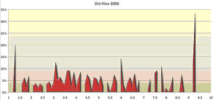
Brandt expected to see a chart that started high on the left, and tapered down as it moved to the right. But there seemed to be little correlation between position and click through. This runs counter to our eye tracking, which showed a strong correlation, primarily on first page visits. Top sponsored ads on Google received 2 to 3 times the click throughs.

enquirorank

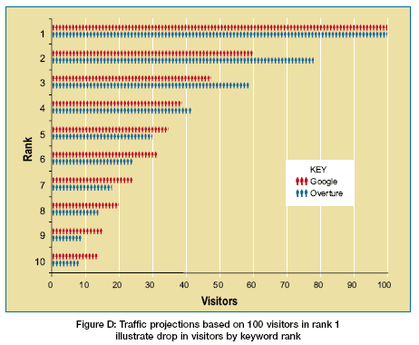
Further, Atlas OnePoint did some analysis from their data set, and similarly found a fairly high correlation between position and click through on Google and Overture/Yahoo.

atlasrank

So why the difference?

Well, here are a couple thoughts right off the bat. Dainow’s data is exclusively for his campaigns. We don’t see click through rates for the other listings, both paid and non-paid, on the page, so we can’t see how his ads stack up against others on the page. Also, it may be that for the campaigns in question, Brandt’s creative is more relevant than the other ads that show. He makes the point that creative is more important than position. I don’t necessarily agree completely. The two work together. The odds of being seen are substantially higher in the top spots, and your creative doesn’t work if it isn’t seen. The discriminating searcher that Dainow sees emerging who takes the time to read all the ads isn’t the searcher we see in eye tracking tests. That searcher quickly scans 3 to 4 listings, usually top sponsored and the top 1 or 2 organic listings and then makes their choice. This is not only true of our study, but the recent Microsoft one that just came out. Although Dainow’s charts over time certainly seem to show that position is less important, there could be a number of other factors contributing to this.

I will agree with Brandt though that if seen, relevant and compelling copy does make a huge difference in the click through rate of the ad. And for consumer researchers in particular, I still see search advertiser’s cranking out copy that’s not aligned to intent. But all the evidence I’ve seen points to much higher visibility, and hence, click throughs, in the top sponsored spots.

When looking at analysis like Brandt Dainow is presenting, you have to be aware of all the variables. In this case, I’d really like to know the following:

  • What were the keywords that made up the campaigns
  • What was the creative that was running for his clients
  • What was the creative the competition was running
  • What were the overall click throughs for the page

In doing the analysis, you really need to control for these variables before you can make valid conclusions. Some are ones we can know, others, like the overall click throughs, only the engines would know.

But Dainow is quick to point that his findings show the need for individual testing on a campaign by campaign basis. And in that, we’re in complete agreement. Our eye tracking tests and other research shows general patterns over common searches, and the patterns have been surprisingly consistent from study to study. It probably gives us as good idea as any what typical searcher behavior might be. But as I’ve said before, there is no such thing as typical behavior. Look at enough searches and an average, aggregate pattern emerges, but each search is different. It depends on searcher intent, it depends on the results and what shows on the page, it depends on the engines,  it depends on what searchers find on the other side of the click. All these things can dramatically affect a scan pattern. So while you might look to our studies or others as a starting point, we continually encourage you to use our findings to set up your own testing frameworks. Don’t take anything for granted. But that’s a message that often doesn’t get through. And my concern is that advertisers looking for a magic bullet will read Dainow’s conclusions highlighted at the top of this post and swallow them whole, without bothering to digest them. And there’s still far too many question marks about this analysis for anyone to do that. I’ve contacted Dainow to set up a chat so I can find out more. Hopefully we can shed more light on this question.

Social Networking Research Update from KnowledgeStorm

A few posts ago I talked about KnowledgeStorm’s new study on the use of social networking by B2B technology buyers. Apparently, the two facts that were getting reported were a little misleading in the way they were presented. Matt Lohman from KnowledgeStorm clears them up:

“I wanted to thank you for referencing the recent research study from KnowledgeStorm. I thought I would clarify some of the confusion with the respondent percentages: The write up of results that you reference is a bit misleading. I’ll try to explain without getting too off the deep end…

We asked about familiarity with social networks first, for which 35% replied “not familiar at all” while another 42% replied “somewhat familiar” adding up to the 77% figure. As part of further validation, the next question asked “How often do you visit social networking sites?” from which we received 31% stating “Never”. This is very close to the 35% who were “not at all familiar” in the previous question. Good confirmation there. From that point forward in the questioning, we excluded anyone who claimed they “never” visit social networking sites (the 31%). Therefore, when we got to the question that asked “What are your primary reasons for using social networking sites?” the only respondents were those individuals who visit social networking sites at least once a month (69%). Of the individuals using these sites, 70% are doing so for business development networking or development reasons.

I still think your conclusions are valid but also wanted to make sure our research wasn’t getting misconstrued. “

Thanks Matt

Why No “Golden Triangle” in the Microsoft Eye Tracking Study

Over at Searchengineland, Danny Sullivan did a deeper dive into the Microsoft Eye Tracking Study that I posted about last Friday. In it, Danny said:

“Interesting, the pattern is different that the “golden triangle” that Enquiro has long talked about in its eye tracking studies, where you see all the red along the horizontal line of the top listing (indicating a lot of reading there), then less on the second listing, then less still as you move down. “

I just want to draw a few distinctions between the studies. In our study, we wanted to replicate typical search behavior as much as possible, so let people interact with actual results pages. In the Microsoft study, they were testing what would happen when the most relevant result was moved down the page and how searchers responded to different snippet lengths. The results, while actual results, were intercepted and were restructured in a way (i.e., stripping out sponsored ads) to let the researchers test different variables. We have said repeatedly that the Golden Triangle is not a constant, as is shown in our second study, but follows intent and the presentation of the search results.

In fact, the Microsoft study does confirm many of our findings, in the linear scanning of results, the scanning of groups of results and the importance of being in the top 5.

Another potential misconception that could be drawn from Danny’s interpretation of results is hard and fast rules about how many results searchers scan. He settled on the number five. When looking at eye tracking results, it’s vital to remember that there is no typical activity. Please don’t take an average and apply it as a rule of thumb. Averages, or aggregate heat maps, are just that. They’re what happens when you take a lot of different sessions, varying greatly, and mash them together. Scanning activity is highly dependent on the intent of the user and what appears on the search results page. A particularly relevant result in top sponsored, matched to the intent of the majority of users, would probably mean little scanning beyond the first or second organic result. On the other hand, if the query is more ambiguous, you could see scanning a lot deeper on the page. The Microsoft study used two tasks that would generate a limited number of queries, and recorded interactions based on this limited scope. Our studies, while using more tasks, still out of necessity represented the tiniest slice of possible interactions.

After looking at over a thousand sessions in the past 2 years, I’ve learned first hand that there are a lot of variables in scanning patterns and interactions with the search page. An eye tracking study provides clues, but no real answers. You have to take the results and try to extrapolate them beyond the scope of the study. We spent a lot of time doing this when writing up both our reports. You try to find universal behaviors and commonalities, but you have to be very careful not to accept the results at face value. Drawing conclusions such as snippet lengths should be longer or that official site tags should become standard are dangerous, because it’s not true for every search. The study actually found that ideal snippet length is highly dependent on the task and intent of the user.

If anything, what eye tracking has shown me is the need for more flexible search results, personalized to me and my intent at the time.

New Microsoft Eye Tracking Study

Microsoft has just released the results of an internal eye tracking study that looked at the impact of snippet length. For more detail, visit Marina Garrison’s blog where she looks at the notable findings.

msheatmapm

A few quick ones and some comments:

Snippet length doesn’t seem to impact people’s search strategies.

This makes sense to us. We found scanning for word patterns rather than actual reading. In fact, a longer snippet may actually detract from the user experience in certain scenarios, such as navigational search. It makes it more difficult to pick up information scent quickly. Remember, we’re on and off the search page as quickly as possible.

People scan 4 listings regardless

This is definitely aligned with the Rule of 3 (or 4) we found in our eye tracking study. We found, however, that this isn’t a hard and fast rule, but rather a pretty common tendency. It changes depending on whether top sponsored ads appeared, how closely aligned the top result was to intent and other factors. But in general, we would agree that most people tend to scan 3 or 4 listings before clicking on one.

Scenario Success Rates Dropped Dramatically as the “Best” Listing Moved Down the Page

No big surprise here. This was referred to in our first study as the “Google” Effect, and it comes from our being trained that best result should show up on top. I actually co-authored a paper with Dr. Bajaj and Dr. Wood at the University of Tulsa about this very topic. By the way, it was Dr. Bajaj that called it the “Google” Effect, not me, so please Yahoo and Microsoft, don’t beat me up on this one.

The report is available for download.

The Ultimate Market Research Technique?

sharingbrainThis is kind of cool, in a really creepy way. According to a recent study, Scientists can now tap into the brain and predict whether you’re going to buy something or not. Not to get all scientific on you, but apparently a portion of the brain called the nucleus accumbens “lights up” on a brain scan if you’re ready to whip out the plastic. But, if the price tag is out of your budget range, another region of the brain called the insula is activated and the mesial prefrontal cortex is deactivated. Dr. Brian Knutson of Stanford and his team are doing the research.

So, think of this future scenario:

Google gets wind of this and brings this into the Google Labs. They work with Intel to develop a small implantable chip that constantly monitors this part of the brain. Through a secret agreement with the U.S. Government, giving the Homeland Security teamaccess to everyone’s online history, Google gets the right to implant the chip in every new child born in the U.S. The chips are connected through wi-fi, so that Google can monitor everyone’s inclination to make a purchase. You can now test your Google campaigns right down to the purchase, setting up A/B tests with the ultimate feedback loop.

Mmm..the mind boggles with the possibilities here….

US Statistical Abstract: Time Well Spent?

The U.S. Census Bureau just released their new Statistical Abstact for 2007. In it, they predict the amount of time adults and teens will spend consuming media in various forms:

  • 65 days in front of the TV
  • 41 days listening to radio
  • A little over a week on the Internet in 2007
  • Adults will spend about a week reading a daily newspaper
  • Teens and adults will spend another week listening to recorded music
  • Consumer spending for media is forecasted to be $936.75 per person

What was interesting about this was noticing the gap that still exists between TV and Radio consumption and time spent on the Internet. To me, it’s indicative of the nature of engagement, at least for now.

According to these stats, we will spend 10X the amount of time in front of a television than we will spend in front of a computer cruising the Internet. The media release didn’t elaborate on the nature of time spent on the Internet. Does this mean work time as well?

Given these numbers, one can understand why the lion’s share of ad budgets still go to television, and I expect that TV sales execs will gleefully quote these given every possible opportunity. But consider the following:

  • The consumption of entertainment content online is in it’s infancy. Strike that, it’s actually embroyonic. If YouTube is the barometer of where we’re at, we have an immense way to go. All the hype about online video is still largely centered around viral growth amongst very early adopters who are watching amateur videos less than 3 minutes in length. It’s not the actual current  impact of online video that’s creating buzz, it’s the paradigm shifting that we have to do when we consider the democratization of content creation, the searchability of the digital format and the interactive possibilities that come with the online distribution channel.  All these things speak to a totally new experience. We’re just not there yet.
  • Think about the difference in your engagement level when you’re interacting with the Internet, as opposed to passively watching TV or listening to the radio. Think about how you respond to advertising messaging, especially when it’s relevant to the task you’re pursuing. The influence of this difference in engagement on consumers hasn’t been quantified yet, but at a gut level, we know it should be significant, probably a quantum leap in effectiveness. Actually, the numbers drive this home. In the research that’s been done on the impact of various channels on consumers, the Internet consistently ranks near the top, usually right after word of mouth, and much higher than television. And it has this impact with one tenth of the exposure time.
  • We need time to change our habits. Television watching has been ingrained in our daily routine for decades. Radio for a bit longer. Newspapers for centuries. The Internet is just celebrating its first decade as a widely accessible channel, and high speed access is less than 5 years old. Given that, the one week number is actually quite remarkable.

I’m sure these numbers will be quoted often, and spun in drastically different directions, depending on who’s doing the spinning. At first glance, my thought was “only one week?”. But as I thought about it, the numbers just emphasized the vast potential of online. What will be fascinating is to revisit this in a year’s time and see how these numbers change. In Internet terms, 12 months is an eternity.

No Real Surprises in the Latest iCrossing Study

iCrossing released the results of a new study conducted by Harris Interactive just before the holidays. The study looked at the role of online in the CPG market. A media release outlines the key findings, including:

  • Consumers look for CPG’s online, with 39% of US adults confirming they’ve conducted a search for CPG’s.
  • Women do this more than man. Footwear and apparel lead the categories searched for.
  • Online CPG searches often result in offline sales. Much of this activity is looking for sales or special offers at traditional bricks and mortar retail locations.
  • Activity is spread pretty evenly over search engines, retailer websites and manufacturer’s sites. Shopping engines and consumer information sites have substantially less traffic.

There are a few notable take aways here that speak to the future use of online. Most CPG’s have been slow to move to online as a marketing channel. The more commoditized the product, the less the online research activity, or so traditional marketing wisdom has told us. Certainly, CPG’s have been very slow to enter the search arena, yet the iCrossing study tells us that there is a significant portion of the consumer population are turning online to research these every day purchases.

To be honest, I think the study is probably underreporting the frequency of this. At Enquiro, we’re steering away from self reported survey based vehicles as a sole vehicle to look at search behavior, because we find that people have trouble recalling how often they use search and what they use it for. It’s become second nature for us to turn to online, and that in turn usually means search. So in a survey like the iCrossing one, memory lapses usually mean overly conservative numbers.

Another notable trend that would influence the findings are the increasing spread of high speed internet access. The likelihood of this CPG online activity happening is directly related to how handy a computer with an internet connection is. The more ubiquitous access is, the more we’ll do a quick look up on everything. About the only purchases I make now that I don’t do some form of online research about are groceries. And as local search becomes more robust, that will probably change too.

I’ve been predicting another surge of advertising dollars migrating into search over the next year or two. As we understand more how universal online research truly is, and how a lot of major advertisers are completely missing this very important touchpoint, more budget will find it’s way into search. While there are no real surprises in the iCrossing study, it’s good that major advertisers are continually reminded that they’re missing a rather large boat.

Google Pulls Back the Curtain on Quality Score – a Little

At the last few shows I’ve attended, an interesting theme emerged. Up to now, reverse engineering an algorithm was exclusively a preoccupation on the organic side. SEO’s would try to out wit and out guess Yahoo and Google’s black box. But with the introduction of quality score, that game suddenly moved to the sponsored side of the strategy table. Because the factors that went into the quality score weren’t disclosed, particularly by Google, it was a game of test and guess by advertisers. A lot of show attendees were expressing frustration that there wasn’t more transparency. Google has apparently heard the call, and yesterday issued a clarification.

Google’s advice?

  • Link to the page on your site that provides the most useful and accurate information about the product or service in your ad.
  • Ensure that your landing page is relevant to your keywords and your ad text.
  • Distinguish sponsored links from the rest of your site content.
  • Try to provide information without requiring users to register. Or, provide a preview of what users will get by registering.
  • In general, build pages that provide substantial and useful information to the end-user. If your ad does link to a page consisting of mostly ads or general search results (such as a directory or catalog page), provide additional information beyond what the user may have seen in your ad or on the page prior to clicking on your ad.
  • You should have unique content (should not be similar or nearly identical in appearance to another site). For more information, see our affiliate guidelines.

While a step forward, there’s still a lot hidden under the hood of this algorithm. Anytime you put algorithms in charge, it opens the door to reverse engineering, and you can bet the SEM community is going to launch a barrage of tests to try to determine the nuances that determine the quality of a landing page in the eyes of the quality score algorithm.

What this does do, however, is increase the complexity of the quality score substantially. There are now three seperate components, including user click through, ad quality and landing page quality. Each addition exponentially increases the complexity of the algorithm, making it a lot tougher to game. It harkens back to the original introduction of the Google PageRank algorithm, which went beyond on-the-page factors to introduce the whole concept of authority within the structure of the Web.

How important is the quality score? It’s vital. Moving up the ranks on the sponsored side is at least as important as on the algorithmic side, and if you can make the leap from the right rail to the top sponsored ads, you can expect a 3 to 10X increase in visibility and click throughs.

Our recent eye tracking study showed just how important relevancy is in these top spots. And Google has always been very aware of that importance. They have an obsession about providing relevancy above the fold, especially in the Golden Triangle, that is not matched by any of the other engines. I actually had a chance to chat with Marissa Mayer about this. The interview will be part of the Eye Tracking study (currently available, by the way, and you’ll get a free final version with Marissa’s interview when it’s available) but I’ll be including some tidbits in this blog as well.

Tales of Pogo Sticks, Bouncy SERPs and Sticky Pages

First published September 7, 2006 in Mediapost’s Search Insider

Much of what little strategy exists in search marketing is aimed towards the first click from a results page (also called a SERP). The position, the messaging and the landing page experience all assume that we’ve captured that all-important first click. But what about the subsequent clicks? In the search business, this is called pogo sticking, the bouncing back and forth from the search page, and clicking on a number of sites in sequence in an effort to find what we’re looking for.

Desperately Seeking Pogo Stats

We know pogo sticking exists, but when I tried to quantify how common it was, I quickly ran into a lot of closed doors. I tried all the major engines and was told that they don’t divulge that type of information, even in aggregate form. I also tried the monitoring services (comScore, Nielsen, Hitwise) but again came up empty.

So, failing anything more quantitative, we had to turn to our own limited data set. The stats below come from the combination of eye-tracking sessions, where we’ve been able to look for pogo sticking. I’m not sure how accurate it is, but it’s the best we’ve got, so I present it with a whackload of caveats.

We saw pogo sticking occur in 49 percent of the sessions we looked at. We suspect the occurrence of this type of behavior would be even higher in real-world settings. So at least one out of every two searches results in a return visit to the results page. In our sessions, 21.5 percent of them results in two clicks from the SERP, 10.4 percent in three clicks, 4.9 percent in four clicks, and 5.5 percent in five clicks. The remainder (6.8 percent) clicked six times or more.

Google has the fewest pogo sticking sessions, with only 36.4 percent of them resulting in a round trip to the SERP. MSN had the highest percentage, with 59.4 percent. Even if you question the numbers (and you have every right to do so) I believe it’s a pretty safe bet that pogo sticking is a pretty common occurrence.

The Power of the Pogo

Why is this important? Because a return visit looks significantly different than the first visit. And if it happens at least half the time, it’s a factor we’d do well to consider as we lay down our search strategies.

I strongly recommend that all search strategies take into consideration the mind-set of your target customer, within the context of what else appears on the page. This exercise can help you forecast the receptiveness of your target to your position on the page, the messaging you present, and the landing page experience you provide.

Let’s walk through a typical scenario. Our target customer searches for “hybrid SUV’s.” Because we’ve done our market segmentation homework, we know our target is early in the buying cycle, and is looking for alternatives for fuel-efficient SUVs, building a consideration set.

Eye-tracking studies have shown there’s relatively little variance in the scanning activity with most searchers at the beginning. They tend to start at the top and work their way down, with a strong bias toward the No. 1 organic spot. Therefore, in this scenario, we have to look at how enticing these top listings are. In walking through this on a search engine, GM and Lexus had purchased the top sponsored spots, where the majority of searchers start their scanning. The first organic spot belongs to the site hybridcars.com, a comparison of available hybrid SUVs. Given our target and his intent, it’s very likely that this site will capture the majority of first clicks from the page.

Beyond the First Click

If we’re playing in this real estate, we have to look beyond the first click to what might happen on the second and subsequent clicks. Scan patterns spread around more evenly on the page on return visits, without the very strong upper-left bias that tends to create the so-called “Golden Triangle” (so-called because we called it that). People tend to fixate on where the last listing clicked, and then can head out in multiple directions from there, either continuing down the listings, skipping up to take another look at the top sponsored, or even a quick glance across to the side sponsored ads. Whereever they choose, their interactions will now be colored by what happened in that first click.

Our strategy now has to account for the influence of that likely first click. We have to know how it will alter or reinforce the intent of our user. We also need to know how sticky the landing page behind that first click is. Is it the type of page that will hold him, and possibly send him off in another direction, or is it a quick bounce back to the SERP because it isn’t well aligned to our target’s intent? Does it reinforce our brand, or our competitor’s? What appears above the fold, and what appears below the fold? Again, we know from eye- tracking studies that this is the critical divide of the page in terms of scanning activity.

When one realizes the impact of pogo sticking, it suddenly means that our search strategy doesn’t play out in a vacuum. It’s intimately dependent on what else appears on the results page, and the most likely paths our target will take from that page. It increases the complexity of our strategy exponentially. The only way to successfully navigate it is to have a clear view of the intent of our target. Sure, it makes search marketing more difficult, but it also makes it infinitely more interesting!

What’s Up with Verticals?

First published July 27, 2006 in Mediapost’s Search Insider

You probably haven’t given a lot of thought lately to vertical search results, that thin sliver of search real estate that is sandwiched between the top sponsored ads and the top organic ads, and generally shows a few lines of news results, or local, or products. I have. Don’t panic, there’s really no reason why you should have. It’s really just a sad comment on my day-to-day activities. But I’ve noticed some things, and I think it’s incumbent upon me to share them with you. So let’s get vertical for a few moments, shall we?

In a Location Near You

First, this is prime real estate. When vertical results appear on the major engines, they appear smack in the middle of the hottest part of the page. After a number of eye tracking studies, we can say with a degree of certainty that most searchers (upwards of 80 percent) at least look at the top sponsored ads and the top three or so organic ads. That means that vertical, wedged in between, will be at least grazed over by a lot of eyeballs.

But position is not enough. Working the vertical angle is not just about grabbing some prime real estate. Verticals have to offer information scent. The information, links and visual cues they offer have to align with the user’s intent. In one bizarre example we saw during our latest study, somebody searched on Google for “digital cameras.” For some reason, Google saw fit to return news results for digital cameras. Now, just what percentage of the over two million people who searched for “digital cameras” last month (a quick estimate courtesy of Yahoo) do you guess would be looking for the scoop on how Nikon had to recall 710,000 digital camera batteries? Maybe the ex-product manager from Nikon, in between looking for new jobs on Monster, but that’s about it.

Hopelessly Devoted to OneBox?

While we’re on the subject, what’s the deal with Google and verticals anyway? Search pundit Greg Sterling said in a blog post some time ago that Google had an “almost religious devotion to OneBox,” its vertical label of choice. Could be, but it seems that a few in the temple of Google are questioning their religious affiliations. OneBox results have been a little sketchy of late. The reason this came to light is that I’ve just looked at 100-plus sessions in Google for a recent study, and there were surprisingly few of those sessions with OneBox results showing.

First of all, they hardly ever show for product-based searches. Try it for yourself. I must have tried over a dozen different common product searches before I got one that returned Froogle results via OneBox. Now why would that be? Well, for one thing, OneBox real estate competes with top sponsored ads, and perhaps advertisers are starting to resent the increased competition in their neighborhood for highly commercial searches. If that theory is correct, it flies in the face of Google’s goal to provide the most relevant results for each query, no matter what the source of the results. Another reason might be that Froogle has never really gained traction as a shopping engine. Maybe Google’s quiet dialing down the rate of appearance of Froogle results on the main page is their way of admitting that these results aren’t adding value to the user experience.

Doing Vertical Right

If you’re looking at a good example of Vertical execution, Yahoo seems to be currently leading the pack with its Shortcuts. The display of vertical results is consistent, and they seem to be one step ahead of the competition in aligning results with user intent.

Here are some examples we saw in a recent study:

One of the tasks given was to research the upcoming purchase of a digital camera. This resulted in a number of related queries being used, ranging from very general (“digital cameras”) to very specific (“Canon Powershot A530”). When these queries were thrown at Yahoo, the engine was able to differentiate and return appropriate vertical results. Broad generic phrases returned vertical results that compared known brands or allowed browsing by features. More specific queries returned links that led to reviews and best prices for that model alone. It was a great example of results matching intent, and we saw the interaction with these results go up dramatically as an example.

One very bright thing that Yahoo does consistently in its vertical listings is provide a 5-star rating scale. It appears for products, some local results (restaurants, hotels) and in various other places. When it comes to attracting our eye, nothing does the trick better than a visual cue that promises ratings. We love lists that sort from most popular to least popular. It’s the paradigm of the consumer researcher, and it’s something that reeks of scent. We saw eyeballs attracted to these icons like search marketers to an open bar (come on, I know many of you are already scoping out the cocktail network for San Jose).

A Vertical Future

I still believe that verticals mark a path into search’s future, but until the engines do better at disambiguating intent, either through personalization, behavioral tracking or just really smart key phrase parsing, they will be relegated to the thin sliver of real estate they currently occupy. Their success in luring users into what Sterling called a “Page 2” vertical experience will lie solely in how well they deliver on intent.