Google Pulls Back the Curtain on Quality Score – a Little

At the last few shows I’ve attended, an interesting theme emerged. Up to now, reverse engineering an algorithm was exclusively a preoccupation on the organic side. SEO’s would try to out wit and out guess Yahoo and Google’s black box. But with the introduction of quality score, that game suddenly moved to the sponsored side of the strategy table. Because the factors that went into the quality score weren’t disclosed, particularly by Google, it was a game of test and guess by advertisers. A lot of show attendees were expressing frustration that there wasn’t more transparency. Google has apparently heard the call, and yesterday issued a clarification.

Google’s advice?

  • Link to the page on your site that provides the most useful and accurate information about the product or service in your ad.
  • Ensure that your landing page is relevant to your keywords and your ad text.
  • Distinguish sponsored links from the rest of your site content.
  • Try to provide information without requiring users to register. Or, provide a preview of what users will get by registering.
  • In general, build pages that provide substantial and useful information to the end-user. If your ad does link to a page consisting of mostly ads or general search results (such as a directory or catalog page), provide additional information beyond what the user may have seen in your ad or on the page prior to clicking on your ad.
  • You should have unique content (should not be similar or nearly identical in appearance to another site). For more information, see our affiliate guidelines.

While a step forward, there’s still a lot hidden under the hood of this algorithm. Anytime you put algorithms in charge, it opens the door to reverse engineering, and you can bet the SEM community is going to launch a barrage of tests to try to determine the nuances that determine the quality of a landing page in the eyes of the quality score algorithm.

What this does do, however, is increase the complexity of the quality score substantially. There are now three seperate components, including user click through, ad quality and landing page quality. Each addition exponentially increases the complexity of the algorithm, making it a lot tougher to game. It harkens back to the original introduction of the Google PageRank algorithm, which went beyond on-the-page factors to introduce the whole concept of authority within the structure of the Web.

How important is the quality score? It’s vital. Moving up the ranks on the sponsored side is at least as important as on the algorithmic side, and if you can make the leap from the right rail to the top sponsored ads, you can expect a 3 to 10X increase in visibility and click throughs.

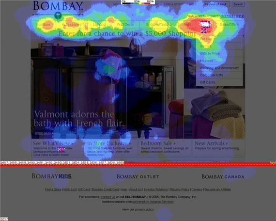
Our recent eye tracking study showed just how important relevancy is in these top spots. And Google has always been very aware of that importance. They have an obsession about providing relevancy above the fold, especially in the Golden Triangle, that is not matched by any of the other engines. I actually had a chance to chat with Marissa Mayer about this. The interview will be part of the Eye Tracking study (currently available, by the way, and you’ll get a free final version with Marissa’s interview when it’s available) but I’ll be including some tidbits in this blog as well.

What’s Up with Verticals?

First published July 27, 2006 in Mediapost’s Search Insider

You probably haven’t given a lot of thought lately to vertical search results, that thin sliver of search real estate that is sandwiched between the top sponsored ads and the top organic ads, and generally shows a few lines of news results, or local, or products. I have. Don’t panic, there’s really no reason why you should have. It’s really just a sad comment on my day-to-day activities. But I’ve noticed some things, and I think it’s incumbent upon me to share them with you. So let’s get vertical for a few moments, shall we?

In a Location Near You

First, this is prime real estate. When vertical results appear on the major engines, they appear smack in the middle of the hottest part of the page. After a number of eye tracking studies, we can say with a degree of certainty that most searchers (upwards of 80 percent) at least look at the top sponsored ads and the top three or so organic ads. That means that vertical, wedged in between, will be at least grazed over by a lot of eyeballs.

But position is not enough. Working the vertical angle is not just about grabbing some prime real estate. Verticals have to offer information scent. The information, links and visual cues they offer have to align with the user’s intent. In one bizarre example we saw during our latest study, somebody searched on Google for “digital cameras.” For some reason, Google saw fit to return news results for digital cameras. Now, just what percentage of the over two million people who searched for “digital cameras” last month (a quick estimate courtesy of Yahoo) do you guess would be looking for the scoop on how Nikon had to recall 710,000 digital camera batteries? Maybe the ex-product manager from Nikon, in between looking for new jobs on Monster, but that’s about it.

Hopelessly Devoted to OneBox?

While we’re on the subject, what’s the deal with Google and verticals anyway? Search pundit Greg Sterling said in a blog post some time ago that Google had an “almost religious devotion to OneBox,” its vertical label of choice. Could be, but it seems that a few in the temple of Google are questioning their religious affiliations. OneBox results have been a little sketchy of late. The reason this came to light is that I’ve just looked at 100-plus sessions in Google for a recent study, and there were surprisingly few of those sessions with OneBox results showing.

First of all, they hardly ever show for product-based searches. Try it for yourself. I must have tried over a dozen different common product searches before I got one that returned Froogle results via OneBox. Now why would that be? Well, for one thing, OneBox real estate competes with top sponsored ads, and perhaps advertisers are starting to resent the increased competition in their neighborhood for highly commercial searches. If that theory is correct, it flies in the face of Google’s goal to provide the most relevant results for each query, no matter what the source of the results. Another reason might be that Froogle has never really gained traction as a shopping engine. Maybe Google’s quiet dialing down the rate of appearance of Froogle results on the main page is their way of admitting that these results aren’t adding value to the user experience.

Doing Vertical Right

If you’re looking at a good example of Vertical execution, Yahoo seems to be currently leading the pack with its Shortcuts. The display of vertical results is consistent, and they seem to be one step ahead of the competition in aligning results with user intent.

Here are some examples we saw in a recent study:

One of the tasks given was to research the upcoming purchase of a digital camera. This resulted in a number of related queries being used, ranging from very general (“digital cameras”) to very specific (“Canon Powershot A530”). When these queries were thrown at Yahoo, the engine was able to differentiate and return appropriate vertical results. Broad generic phrases returned vertical results that compared known brands or allowed browsing by features. More specific queries returned links that led to reviews and best prices for that model alone. It was a great example of results matching intent, and we saw the interaction with these results go up dramatically as an example.

One very bright thing that Yahoo does consistently in its vertical listings is provide a 5-star rating scale. It appears for products, some local results (restaurants, hotels) and in various other places. When it comes to attracting our eye, nothing does the trick better than a visual cue that promises ratings. We love lists that sort from most popular to least popular. It’s the paradigm of the consumer researcher, and it’s something that reeks of scent. We saw eyeballs attracted to these icons like search marketers to an open bar (come on, I know many of you are already scoping out the cocktail network for San Jose).

A Vertical Future

I still believe that verticals mark a path into search’s future, but until the engines do better at disambiguating intent, either through personalization, behavioral tracking or just really smart key phrase parsing, they will be relegated to the thin sliver of real estate they currently occupy. Their success in luring users into what Sterling called a “Page 2” vertical experience will lie solely in how well they deliver on intent.

The Rule of Three in Search

First published July 20, 2006 in Mediapost’s Search Insider

Once again, I find myself up to my earlobes in eye-tracking data. I have no one to blame, as I got myself into this mess when I made the well-intentioned but poorly thought out promise to have the first draft of a study done by the time I head out on vacation at the end of the month.

In wading through the sessions (about 420 of them) sometimes new insights rise to the top–and sometimes my eyeballs just roll back in my head as my hands jerk spasmodically on my keyboard and drool runs down my cheek. Luckily, this week it was the former.

In this study, we are looking at interactions with Google, compared to MSN and Yahoo. Recently, one finding in particular seemed to be screaming out to be noticed. Being a compassionate sort of researcher, I listened.

When we looked at interactions with the top sponsored ads, there was a notable difference between MSN, Yahoo and Google. On MSN and Google, the percentage of clicks happening on these top ads seemed to be in line with previous studies done both by us and by others. But the amount of activity on the Yahoo ads seemed to be substantially higher. We started out by looking at first fixations, or the first place people looked on the page, even for a split second. Here, the engines were all in the same ball park, with 83.7 percent of first fixations in top sponsored ads for Yahoo, compared to 86.7 percent for MSN and 80.6 percent for Google.

Then, we looked at where the first activity on listing happened; where on the page did people start actually scanning listings? Google held a good percentage of eyeballs, keeping 12.4 percent of the users, while MSN had a significant defection issue, losing 36.6 percent of the people who first fixated in the top sponsored ads. But Yahoo lost the fewest, with only 5.5 percent choosing to look elsewhere. And finally, Google had 25.8 percent click-throughs on these ads, and MSN had 16.7 percent (yes, this is low, but MSN was dealing with a number of issues at the time of the study). Yahoo led the pack with a 30.2 percent click-through rate. In fact, for the first time ever in our research, a sponsored link (the number one top sponsored) out-pulled the No. 1 organic link, at click-through rates of 25.6 percent vs. 14 percent. This was a complete reversal of the click-through ratios we saw on the other two engines.

For whatever reason, Yahoo’s top sponsored ads seemed to be locking searchers into their part of the results page to a much greater extent than Google and MSN.

Why? What the heck was going on? Better ads? Not really. If anything, Google’s ads seemed a touch more relevant.

Location, Location, Location

Part of it was real estate. Another interesting comparison we did was to look at the percentages of screen real estate devoted to various sections of the page. Yahoo has gone out of its way to make the top sponsored ads the dominant feature on a results page at 1024 by 768 screen resolution. At this size, the ads take up 23 percent of the real estate, compared to approximately 16 percent for Google and Yahoo. This pushes organic listings on Yahoo perilously close to the fold.

And there, as I stared at the screen shots of fully loaded (maximum ads and vertical results showing) Google, MSN and Yahoo results at standard resolution, a possible answer revealed itself. On Google, three top sponsored ads, three OneBox results, and three visible organic listings. On MSN, the same three:three:three presentation. But on Yahoo, there were four top sponsored ads, three vertical results, and just one and a half organic listings were visible.

The Rule of Three

Hmmm, three, three and three. There was something there, niggling in the back of my mind. Quickly, I did a search for the “Rule of Three” and sure enough, there it was. We humans tend to think in triplets. Three is a good number to wrap our mind around, and we see it in all kinds of instances. We tend to remember points best when given in groups of three, we scan visual elements best when they come in threes, and we like to have three options to consider. Think how often three comes up in our society: three little pigs, three strikes, three doors on “Let’s Make a Deal,” three competitive quotes. It’s a triordered world out there.

So is it coincidence that search results tend to be presented to us, neatly ordered in groups of three? I think not. It strikes me that this engrained human behavior would probably translate to the search engine results page as well.

The Ruler-breaker

MSN and Google tend to adhere to the rule of three in their layouts (depending on whether or not Google serves three top sponsored ads). Our choices are conveniently presented in neat trios, with logical divides between each.

Yahoo breaks the rule by tipping the balance in favor of the top sponsored ads. First, it provides four results, not three. Does this mean we need to spend a little more time up in these results, trying to fit one extra one into our limited memory slots? That appears to be the case, with people spending an average of 4.6 seconds in the Yahoo top sponsored results in our study, compared to 2.4 seconds for Google and 1.73 seconds for MSN.

Second, it only gives us one visible organic listing to consider. It breaks our natural desire to have three alternatives, thereby reducing the Promise of Interest for the organic listings. In effect, on the screen of results most people would see on Yahoo, we only have one alternative, the top sponsored ads.

An earth-shaking discovery? Perhaps not. But cut me some slack. I’ve been looking at eye-tracking data daily for three months now, spending about three hours each day looking at interactions with the three engines. I think it’s time I took the three other members of my family on a three-week vacation, during which we’ll be visiting three countries. Wait a minute! Do I sense a pattern developing?

Branded Terms in Search Results: Pre-Mapping in Action

First published July 6, 2006 in Mediapost’s Search Insider

Two separate occurrences in the last little while have lent credence to a behavioral occurrence we’ve seen in many of our studies.

First, I was sitting in on a meeting where an agency (not ours) was reporting on the performance of its sponsored search campaigns and was ecstatic with the performance of its branded term phrases, which were outperforming every other keyword bucket both in terms of click-throughs and conversions. While giddy with delight, company executives were at a bit of a loss to explain why.

On a similar track, a search marketing firm has recently released some results that looked at cannibalization of search campaigns when you are buying terms where you also hold top organic position. Again, they found this is most likely to happen when you’re buying branded terms.

While neither of these examples should be surprising to a seasoned search marketer, we’re all interested to know the reasons behind this interplay between organic and sponsored, particularly on branded terms. The answer, as it so often does, lies in looking more closely at what the search user is doing.

Pre-Mapping: A Theory

After looking at thousands of search sessions in detail, one thing is becoming clear. Searchers are incredibly adept at focusing in on just the portion of the results page that interests them. The time required to relocate to the prime real estate is literally a fraction of a second. Yet that real estate isn’t always the same spot. It varies depending on query and intent. It also varies by user, but even the same users will navigate the real estate of the listings in very different ways, depending on what they’re looking for.

Pre-Mapping supposes that we’ve interacted with search results pages enough to know the sections of real estate we typically deal with. We know where the top sponsored ads are and what they are. We know about where the top organic listings start. And in our minds, we already have a good idea of the type of site we’re looking for and approximately where we expect it to appear. Before the page ever loads, we’ve already mapped out the sections that would appear to hold the greatest promise to deliver on our intent. As the page loads, we do a split-second scan to get our bearings (orient in the top left corner, see how many top ads there are, see where organic starts) and then we go to the part of the map we’ve predetermined to be our best starting point.

Theory in Practice

Let’s run through a few examples. Imagine you’re looking for the possible side effects of a medication. The types of sites you would be looking for would be authoritative information sites, either the official site for the medication, a recognized health portal or possibly a government information site. In this case, you may be leaning more towards objective sites, rather than the pharmaceutical company’s own site. After launching the search (the name of the drug) you’ll quickly filter out, or thin slice, any commercially oriented sites. In this type of interaction, you’ve determined through pre-mapping that your area of greatest promise is not likely to be in the sponsored ads. You also expect the official site to rank No. 1 organically, so your area of greatest promise is probably in the No. 2 to 5 organic rankings, where you expect the types of sites you’re looking for to sit. In a split second, you’ve narrowed the real estate where you’ll start your active scanning to about 10 percent of the total real estate.

Now, let’s say you’re looking to renew your auto insurance. You’ve already checked out a few quotes online, but before you commit to any, you want to see how your current carrier compares. You’ve also pre-mapped the page in this case. Here, you expect your company to be bidding for the term ( “Brand Name auto insurance”) and because it’s a commercially oriented query, you assume that the sponsored listing would take you to a page where you could get a quote. Your area of greatest promise is the top sponsored ads. Again, you do your orientation scan to find your bearings in the upper left, but in this case, you would start right at the top sponsored link and work your way down the page until you find a link to the carrier in question that offers the promise of giving you a quote.

Theory Applied

Considering these two examples of user behavior, you can easily see what was happening in the two anecdotes I cited at the beginning of this piece. Brand terms will convert like gangbusters in the top sponsored location, because when a brand term is used, it’s very likely that the user has pre-mapped and is expecting to find that site in those top sponsored spots.

Similarly, you will find significant cannibalization because when users have pre-mapped, they start at the top and work down. They’ll hit the sponsored result before they hit any organic result that might appear. They’re looking for the quickest route, and in this case, the sponsored listing is giving it to them.

The likelihood to pre-map, and what this means for interaction for the page, lies in that deep dark place where all the answers to search engine success lie, the mind of your target prospect. Spend some time exploring it.

Usability and Asinine Comments from the Bay

Had a chance to catch one day of Jakob Nielsen’s Usability Week in San Francisco. Yesterday, I sat in on the eyetracking session and saw the results of the Nielsen Norman’s just completed study (numbers are still being crunched as we speak).

It was heartening to see that many of their findings mirrored our own, including F shaped scanning patterns, quick scans of pages and aversion of ads and large graphic blocks. It was in this last category that the asinine comments part comes (that’s why you’re really reading this, isn’t it?).

Jakob was demonstrating interaction with the home page of jcpenney.com. (The picture that I’ll be talking about has changed, but the basic page structure is the same). The heat map image showed clearly that the big block graphic, in this case a picture of a bed with a colorful spread, with some promotional text inset in the upper left and the lower right, received virtually no scanning. All the scanning was in the top navigation bar. The large block graphic “fenced in” the scan area, cutting users off from other promotional information that lay below the graphic. We saw the same thing occur with the Bombay Company site in a eyetracking study we did for MarketingSherpa (see below).

bombays

Some hot shot designer in the room decided to take exception with the proof in from of him, and called out some of the examples that Jakob has shown of large graphics that had received no scanning. He used words like apex composition and other regurgitated terms from a graphic design university text book to show that all the sites adhered to basic design principles and that the theoretical composition of the JCPenney picture was in fact spot on, drawing the eye from one promotional headline to the next. Jakob patiently pointed out the obvious, that the theory breaks down, because as the heat map clearly showed, no eyes were even being attracted, let alone drawn to any headlines. We settled back in our chairs, silently cheering the adroit handling of the blow hard in the back. Much to our amazement, the guy wouldn’t give up, continually going back to the point that the theory is right and works, despite evidence on a screen roughly 40 by 30 feet to the contrary. The mic finally had to be taken away from him.

A couple points here. Theories are theories, not fact. Heat maps are facts, at least for the sample of people in the study. And while you may argue that a sample of a couple hundred (the n of the NN/g study) isn’t representative, I would disagree. We’ve done enough to know that consistent behavior in eyetracking starts to emerge at about 10 people, then defines itself very clearly at 20 to 30 people. So designers, you just may have to forget everything you learned, because the way people interact with information is changing faster than new theories can be created. You have to keep an open mind.

Second of all, this guy was approaching this from a print paradigm, not an online one. His spouting of picture composition and eye flow comes from centuries of guessing about how we look at images. I remember talking to a university arts professor once who was really excited about eye tracking because we could finally find out if all the “crap that’s been spouted about how we look at paintings is even true or not”. I’m not saying century old principles are wrong, but you have to consider them in the appropriate context. Take our J.C. Penney picture. Mr. Design Dictionary is correct. The flow of the bed spread and the contours of the bed should hypothetically draw the eye from one headline to the other, if the eye entered the picture in the first place. In the print advertising world, photos act as an attractor. They grab the person who is reading adjacent, usually non relevant content, and pull them over to the ad. They are the entry point. If they do their job efficiently, you have altered the intent of the prospect. They have switched from reading a story to looking at your ad. The job of the photo is to channel this new intent to the right place.

With a website, you have the full intent of the user. That’s why they came to your site. A large block graphic gets in the way of that intent, and will be thin sliced out of the way. Worse, it could block the user from seeing the content on the site that they’re there to see. All the composition theory in the world won’t prevent that. Jakob’s point wasn’t that the picture was composed incorrectly; it was that the picture was a waste of valuable home page real estate.

Probably the most valuable thing I took from yesterday was a comment Jakob made as an aside. Branding online comes from the experience, not the exposure. This was in response to another comment somebody made about large graphics being present for branding purposes, and the seeming contradiction between the need for branding and best practices for usability. Online, a successful brand engagement and a successful user experience are the same thing. If you deliver efficiently on a user’s intent and make their online experience a pleasure, you will build more brand equity than you could ever build with gratuitous flash files, streaming media and huge graphics. The two aren’t mutually exclusive, but all too often online, the designers win at the user’s expense.

RSS Feeds vs E-mails: More Eyetracking Data from Jakob Nielsen

Jakob Nielsen’s Neilsen Norman Group just released an eyetracking study looking at scan patterns of e-mail newsletters vs RSS feeds. The summary results? People spend more time scanning newsletters, but are ruthless in scanning titles that pop up in their newsreaders. Again, both Jakob’s studies and ours seem to keep coming to the same conclusions, we’re evolving a very advanced form of “thin slicing” when we interact with information online. We have to, as there’s an overload of stimuli. I’m heading down to San Francisco next week to spend some time at Jakob’s usability summit, and hope to chat with him more about this.

Relevancy Rules in Sponsored Search Ads

First published May 4, 2006 in Mediapost’s Search Insider

Let me quote some rather startling numbers to you from a recent eye tracking study we did. In the study, we examined where people first looked on a search results page, where they first scanned a listing, and where they eventually clicked.

First of all, we gave participants a number of different scenarios that involved looking to a search engine to help them make a purchase. We used Google, Yahoo and MSN in the study. In all cases, on all 3 engines, the vast majority of people first glanced at the top- sponsored listings. In eye tracking parlance, we call this a fixation, or a momentary pause of the eye. On Yahoo, 84 percent of the first fixations were on the top sponsored listings when they appeared, on Google it was 81 percent, and on MSN it was 87 percent. So, almost nine out of every 10 people start looking at the search results page by at least glancing at the top sponsored listings

The next thing we measured was active scanning. This is where participants started reading a listing. On Google and Yahoo, there was strong correlation with the first fixation point, with 79 percent of the first reading activity on top sponsored for Yahoo, and 71 percent for Google. MSN was another story. While 87 percent of participants first glanced at the top sponsored ads, only 55 percent started reading there. Almost 32 percent of our participants immediately relocated past the sponsored ads.

Finally, we recorded where the eventual clicks happened. In Google’s case, 26 percent of the clicks happened in the top sponsored ads, with Yahoo it was 30 percent, and MSN came in with 17 percent click through on top sponsored.

Here’s what we took from the numbers. On Google, although over 80 percent of searchers started in the top sponsored, only 26 percent found something relevant and compelling enough to click on, and remember, these were commercial, product oriented searches. On Yahoo, 84 percent started in top sponsored, but in Yahoo’s case, about 30 percent stuck around and clicked an ad. And with MSN, something entirely different was going on. It seems that MSN users have a bad case of banner blindness when it comes to top sponsored ads.

Scanning Follows Relevancy

The reason top sponsored ads are effective is because they’re placed in the highest traffic portion of the page. We orient ourselves in the page on the upper left. Our destination is the top organic ad. Top sponsored ads are placed in the middle of the most popular real estate on the SERP. This is shown by the high percentage of fixations that happen in this section.

But our interactions with the SERP are not all about position. We can, very quickly, determine if what’s there is relevant to what we’re looking for. We quickly scan titles to see if the ads presented match our intent. And when I say quickly, I’m talking fractions of a second. We start picking up relevancy without even having to read the listings by determining scent. If the listing has “scent” and it’s a good match, we’ll not only hang around and start scanning the listing, we may even click on it. Otherwise, we do what we intended to do in the first place and skip down to the organic listings. That’s what’s happening on Google and Yahoo. MSN is another story.

The MSN Two-Step

During the study period, MSN was in experimentation mode. It was in the process of dropping Yahoo ads from the top listing and substituting its own advertising, which in most cases wasn’t keyword-driven to the same extent that the Yahoo ads were. This usually meant that the “scent” or relevancy match wasn’t as great. When this happened, we saw almost immediate relocation down to organic results. Users could determine the existence, or in this case, absence of scent in a fraction of a second and relocated down. In effect, it was an example of banner blindness, where they were determining that the top sponsored results weren’t relevant.

The lesson from this for the search engines is that you can’t take position for granted. You have to deliver with relevancy and the greater the relevancy, or at least, the perceived relevancy, the better those top sponsored ads will perform.

Yahoo’s Relevancy Capitulation

Yahoo has learned this over time. In the beginning days of GoTo/Overture/Yahoo, position was determined solely by bidding. When Google came on the scene, it offered a blended approach, where click-through rates also helped determine position. The theory was, the higher the click-through rate, the greater the relevancy.

Yahoo has recently announced integrating click through rates and relevancy into the sponsored positioning algorithm as well. This is the beginning. Soon, message and landing page relevancy will also be factored into the position equation.

When it comes to capturing a searcher’s click, you have to deliver relevancy. It’s not all about position–and this fact will become more true in the future, not less.