
Anytime we talk about human behavior thats triggered by the equipment we all ship with – namely our brains-we have to account for variations in how that equipment operates. We are not turned out by assembly line, with quality control measures insuring that all brains are identical. Each brain is distinct, formed both by our own genetic signature and by our environment. While variation across the human genome is remarkably minor, we are all products of bespoke design – handcrafted to make us uniquely us.
Distribution of Our Uniqueness
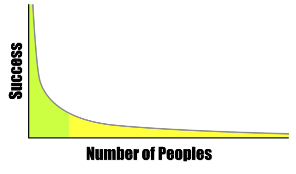
 This variation typically plays out in a normal distribution curve, more commonly known as a bell curve. Most of us cluster towards the center – the norm. And as we move out from the center, venturing one or two standard deviations from the norm into outlier territory, our numbers drop dramatically.
If we talk about the phenomenon of entertainment, we are definitely talking about how our brains operate. This means that we could expect to find a normal distribution in attitudes towards entertainment, with a peak in the middle and rapidly descending slopes on both sides. For example, one would expect such a distribution in the types of entertainment we prefer: the books we read, the shows we watch, the music we listen to. in fact, with a little statistical origami, we can do a quick check on this. Take a standard distribution curve and fold it in half along the “norm” line (shown as 0). The shape should look familiar. We have Chris Anderson’s Long Tail. The similarity of tastes close to the norm accounts for blockbusters and best sellers. These are the forms of entertainment that appeal to the greatest number of individuals. More esoteric entertainment tastes live well down the curve, in outlier territory.
The Need for Entertainment Scale
I’ll come back to the types of entertainment we prefer and why in a later post. Today, I want to concentrate on another variable in the human psyche that also can impact our engagement with entertainment: how much do we need to be entertained? Why are some of us drawn more to fiction and others to non-fiction. Why do some of us like the escapism of a TV sitcom and others prefer to watch the news? Why do some of us have 5 TV’s in our house, with hundreds of digital channels, and others have none? What does the normal distribution curve of our need for entertainment look like. That was exactly the question that Timothy Brock and Stephen Livingston from Ohio State University tackled (The Psychology of Entertainment Media: Blurring the Lines between Entertainment and Persuasion. Publisher: Lawrence Erlbaum Associates. Place of Publication: Mahwah, NJ. Publication Year: 2004. p 255-268).
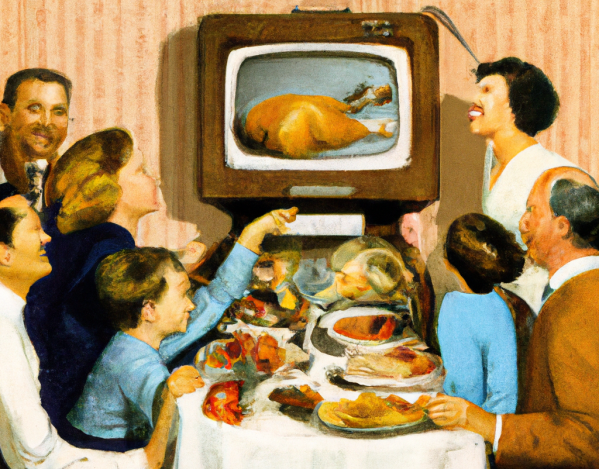
The need for entertainment seems to be almost addictive in some cases. In the study, Brock and Livingston restrict their definition of entertainment to passive consumption of some form of entertainment, either TV, radio, film, print, theatre or sport spectacles. Of these, television is the most common, so many of the measures revolved around our relationship with that specific entertainment medium. I’ve talked before about the impact of TV on society, but some of the empirical research on our reliance on the tube is astounding. In 2002, Robert Kubey and Mihaly Csikszentmihalyi found troubling evidence of a true biological addiction to TV:
“To track behavior and emotion in the normal course of life, as opposed to the artificial conditions of the lab, we have used the Experience Sampling Method (ESM). Participants carried a beeper, and we signaled them six to eight times a day, at random, over the period of a week; whenever they heard the beep, they wrote down what they were doing and how they were feeling using a standardized scorecard.“As one might expect, people who were watching TV when we beeped them reported feeling relaxed and passive.
“What is more surprising is that the sense of relaxation ends when the set is turned off, but the feelings of passivity and lowered alertness continue. Survey participants commonly reflect that television has somehow absorbed or sucked out their energy, leaving them depleted. They say they have more difficulty concentrating after viewing than before. In contrast, they rarely indicate such difficulty after reading. After playing sports or engaging in hobbies, people report improvements in mood. After watching TV, people’s moods are about the same or worse than before.
“Thus, the irony of TV: people watch a great deal longer than they plan to, even though prolonged viewing is less rewarding. In our ESM studies the longer people sat in front of the set, the less satisfaction they said they derived from it. When signaled, heavy viewers (those who consistently watch more than four hours a day) tended to report on their ESM sheets that they enjoy TV less than light viewers did (less than two hours a day).
What value do we place on the ability to watch TV? Brock and Livingston gave 115 undergrads two scenarios. In the first, they could correct a hypothetical mix up in their official state citizenship in return for a one time cash gift. The undergrads were asked to put a value on changing their official allegiance from one state to another. 15% would do it for free and another 40% would do it for under $1000.
The next scenario asked the students what compensation they would require to give up TV for the rest of their lives. A permanent tracking implant in their ear would notify a monitoring service if they cheated and the entire gift would be forfeited. 8% were willing to do it for free, but over 60% would need at least a million dollars to give up TV forever.
Findings: Men Need More Entertainment & The More You Think , The Less You Need to Be Entertained
In their scale of the need for entertainment, Brock and Livingston assessed three factors: Drive (how actively do you pursue passive entertainment?), Utility (how useful is passive entertainment, both to you specifically and in general?) and Passivity (how active do you like your entertainment to be?).
So, how do we fare on our need to be entertained, based on Brock and Livingston’s scale? First of all, men seem to have a stronger drive to be entertained than women. Males scored higher on the amount they spend on entertainment, the daily need for entertainment and the inability to function without entertainment. One would assume that the “couch potato curve” would skew to the male side of the demographic split.
Also interestingly, Brock and Livingston found an inverse relationship between the need to be entertained and the “need for cognition” – a measure of how much people like active problem solving and critical thinking. Again, the more you think, the less reliant you are on TV.
In a follow up study, Brock and Livingston tried to draw a defining line between entertainment (in their definition, passive consumption) and sensation seeking. I’ll touch on this in tomorrow’s post.


